
 Open Access Article
 This Open Access Article is licensed under a
 Creative Commons Attribution 3.0 Unported Licence
Visualizing high entropy alloy spaces: methods and best practices†
Brent
Vela
 a,
Trevor
Hastings
*a,
Marshall
Allen
ab and
Raymundo
Arróyave
a
a,
Trevor
Hastings
*a,
Marshall
Allen
ab and
Raymundo
Arróyave
a
aMaterials Science and Engineering Department, Texas A&M University, College Station, TX, USA. E-mail: trevorhastings@tamu.edu
bMechanical Engineering Department, Texas A&M University, College Station, TX, USA
First published on 4th December 2024
Abstract
Multi-Principal Element Alloys (MPEAs) have emerged as an exciting area of research in materials science in the 2020s, owing to the vast potential for discovering alloys with unique and tailored properties enabled by the combinations of elements. However, the chemical complexity of MPEAs poses a significant challenge in visualizing composition–property relationships in high-dimensional design spaces. Without effective visualization techniques, designing chemically complex alloys is practically impossible. In this methods article, we present a suite of visualization techniques that allow for meaningful and insightful visualizations of MPEA composition spaces and property spaces. Our contribution to this suite are projections of entire alloy spaces for the purposes of design. We deploy this of visualization techniques on the following MPEA case studies: (1) constraint-satisfaction alloy design scheme, (2) Bayesian optimization alloy design campaigns, (3) and various other scenarios in the ESI. Furthermore, we show how this method can be applied to any barycentric design space. While there is no one-size-fits-all visualization technique, our toolbox offers a range of methods and best practices that can be tailored to specific MPEA research needs. This article is intended for materials scientists interested in performing research on multi-principal element alloys, chemically complex alloys, or high entropy alloys and is expected to facilitate the discovery of novel and tailored properties in MPEAs.
1 Introduction
Since its advent in 2004,1 the high entropy alloying paradigm has garnered considerable attention, even being described as reviving metallurgy and alloy design.2 Of particular interest to this work is alloy design. Alloy design refers to the systematic process of selecting and optimizing the composition and processing conditions of alloys to achieve desired properties and performance criteria for specific applications.3 This involves navigating complex multi-dimensional compositional spaces to balance competing factors such as strength, ductility, corrosion resistance, and thermal properties.High entropy alloys comprise 4 or more principal alloy components at concentrations ranging from 5 to 35 at%.4 Multi Principal Element Alloys (MPEAs) are an extension of the high entropy alloying paradigm and refer to compositionally complex alloys without a single principal alloy component but do not necessarily meet any prescriptions for configurational entropy.5 The motivation behind the MPEA-paradigm is to explore the compositionally complex inner regions of alloy spaces. To date, many MPEAs with various attractive properties have been identified due to the vastness and compositional diversity of the MPEA space. Such properties include high yield strength,6 good ductility,7 corrosion resistance,8 high/low thermal conductivies9,10 and coefficients of thermal expansion,10 and magnetism.11 However, designing and optimizing these properties often involves trade-offs,3 as improving one property can compromise another. This complexity underscores the need for advanced visualization techniques to effectively navigate the high-dimensional MPEA design space and balance these competing factors.
While chemical diversity has allowed the design and discovery of novel MPEAs, this same chemical complexity makes visualizing composition–property relationships in MPEA systems difficult. The properties of binary alloy systems can be represented on a standard x–y diagram. Making use of barycentric coordinates and the fact that compositional degrees of freedom n is one less than the order of the alloy system e, the properties associated with ternary systems can be plotted over a Gibbs-triangle using contour-lines and color maps. Again making use of barycentric coordinates, quaternary systems (e = 4) can be represented by a Gibbs-tetrahedron. Regions inside this Gibbs-tetrahedron can be colored or partitioned according to properties within the quaternary system. Such 3D visualizations are difficult to quickly interpret, yet are still possible. However, quinary systems and above (e ≥ 5, n ≥ 4) cannot be represented in 3 dimensions. Visualizing high dimensional alloy spaces has been identified as a challenge facing the MPEA community since at least 2017.4
Various attempts have been made to visualize high-dimensional alloy design spaces. Regarding conventional dimensionality reduction techniques, stacks of 3D pseudo-ternary diagrams can be arranged in a way to show how a varying 4th compositional dimension affects the remaining 3 dimensions;4 however, this method is not scalable to arbitrary dimensions. Schlegel diagrams have been suggested as a method to visualize the MPEA space;4 In a Schlegel diagram, a polytope in d-dimensional Euclidean space (![[Doublestruck E]](https://www.rsc.org/images/entities/i_char_e168.gif) d) is represented by a polytope in d−1. This projected polytope will have polytopal subdivisions (edges and nodes) in the facet. In these diagrams, nodes encode the vertices of the polytope, while lines encode the edges of the polytope. In the case of MPEAs, the composition space can be represented as a e − 1-dimensional simplex, i.e., a generalization of triangles and tetrahedra to higher dimensions. This simplex can be represented in a lower dimension by a Schlegel diagram. However, because Schlegel diagrams are only capable of projections from d to d−1, these diagrams would only be useful for 3-dimensional and 4-dimensional composition spaces, i.e., quaternary and quinary systems. Furthermore, with these diagrams, the quinary system could only be visualized in 3D space, adding further complexity to an already relatively complex diagram. Schlegel diagrams would not be useful for projecting senary systems as this projection would be from 5D to 4D.
d) is represented by a polytope in d−1. This projected polytope will have polytopal subdivisions (edges and nodes) in the facet. In these diagrams, nodes encode the vertices of the polytope, while lines encode the edges of the polytope. In the case of MPEAs, the composition space can be represented as a e − 1-dimensional simplex, i.e., a generalization of triangles and tetrahedra to higher dimensions. This simplex can be represented in a lower dimension by a Schlegel diagram. However, because Schlegel diagrams are only capable of projections from d to d−1, these diagrams would only be useful for 3-dimensional and 4-dimensional composition spaces, i.e., quaternary and quinary systems. Furthermore, with these diagrams, the quinary system could only be visualized in 3D space, adding further complexity to an already relatively complex diagram. Schlegel diagrams would not be useful for projecting senary systems as this projection would be from 5D to 4D.
Graph networks have been used to visualize the coexistence of phases in hyper-dimensional thermodynamic space.4,12 In these graph network implementations of phase diagrams, each phase is represented by a node, and if two phases coexist at a given T and P, their nodes are connected by a line.4,12 In a similar vein, via the use of artistic features such as color, line width, and marker shape, so-called ‘Hull Webs’ have been used to visualize thermodynamic quantities, i.e., convex hull depth, reaction driving forces, meta-stability, and the likelihood of phase separation.13 These methods are particularly useful for preserving and visualizing relational information where the connections between entities (e.g., phases) are critical for interpreting the system. While this method provides a means for visualizing the coexistence of phases and other thermodynamic properties, it is not appropriate to visualize arbitrary properties such as price, density, etc. There is a need for a visualization method that can visualize arbitrary chemistry-property relationships for high-dimensional alloy space.
Regarding more sophisticated and interactive visualization techniques, van de Walle et al.14 demonstrated a software capable of visualizing high dimensional phase spaces. The authors demonstrated this framework on the 4-dimensional Cantor alloy space. For a given temperature and pressure conditions, this framework begins by randomly sampling a high dimensional composition space and evaluating the phase equilibria at each sampled MPEA. MPEAs determined to consist of a single phase are discarded; these points are discarded as observations of single phase MPEAs do not provide information regarding phase boundaries. Next, the MPEAs are grouped based on the phases that take part in each equilibrium. Specifically, compositions are grouped based on the endpoints, which of the tie-line these MPEAs lay on and are further grouped based on the phases present at equilibrium. Next, a meshed phase boundary is created. This generates an estimate of the true phase boundary. Once a high-dimensional phase diagram is generated, a cross-section of this ‘high-dimensional’ object can be taken. In this way, the dimensionality of the phase diagram is reduced. Despite the advantages of this method (accurate representation of high dimensional phase space), this framework comes at a high computational cost. Furthermore, this framework is currently limited to visualization phase boundaries and has not been generalized to other alloy properties of interest. While the aforementioned visualization techniques are useful for specific situations, they do not summarize composition properties in MPEA systems of arbitrary dimensionality.
Of particular interest to this article are the works that used dimensionality reduction techniques such as t-SNE (t-distributed stochastic neighbor embedding)15 and UMAP (uniform manifold approximation and projection).16 These techniques aim to project high-dimensional data to a lower-dimensional embedding. Details on these methods are provided in the ESI.† These methods have been used extensively in alloy design. For example, in their work with generative adversarial networks (GANs), Li et al.17 used t-SNE to visualize and compare the high dimensional data distributions generated by their GANs. t-SNE enabled them to effectively demonstrate how different GAN architectures captured the underlying data distribution of alloy compositions. This visualization technique helped identify areas where the models succeeded or fell short, providing critical insights for refining the generative models to better fit the complex, multidimensional alloy design space. Similarly, in our previous works,18 we used UMAP to summarize the composition of a chemically diverse data set of additive manufacturing experiments. The result was a diagram that clustered alloys based on their composition, providing a ‘family portrait’ of the database. Additionally, more advanced dimensionality reduction techniques have emerged, such as TriMap19 and Independent Nonlinear Component Analysis,20 which also aim to provide insights into complex data structures. For example, Jiang et al.21 used TriMap to guide their feature mining and fusion network for natural image matting.
While the aforementioned of t-SNE and UMAP is valid, these dimensionality reduction methods are only trained on a subset of the design space. Consequently, the resulting graphs can be difficult to interpret and often lack the full context of the barycentric nature of alloy design spaces.
In previous works, we used t-SNE and UMAP in a novel way, employing these dimensionality reduction techniques to project high-dimensional barycentric design spaces into 2D. Beginning in 2022,22 predecessors in our group utilized t-SNE to project entire barycentric design spaces, resulting in polygonal 2D diagrams resembling an extension of a Gibbs ternary diagram but for higher-order systems. These projections enabled the visualization of chemistry-structure, chemistry-property, and chemistry–performance relationships. By using t-SNE on the entire barycentric design space, the resulting projection was more interpretable than those based on subsets of the space, as it retained some sense of location within the barycentric coordinate system, putting the data in the context of the full alloy space.
In later works,23–26 we enhanced our visualization approach by adopting UMAP to project barycentric design spaces. UMAP proved superior in preserving both the global and local structure during the projection process, producing plots that closely resembled polygons, similar to ternary diagrams but applicable to higher-order systems. This resulted in more interpretable and meaningful visualizations for alloy design.
However, during the revision of this work, we were encouraged to explore an analytical and deterministic method for projecting barycentric coordinates—specifically, affine projections,27,28 which inscribe high-dimensional barycentric coordinates within a 2D n-polygon. This method offers the same insights as techniques like t-SNE and UMAP but with significantly lower computational costs. Importantly, this projection arguably represents the ‘ground truth’ of what manifold learning methods like UMAP are attempting to approximate, i.e., a barycentric design space projected and inscribed within a 2D polygon.
Projection of entire alloy design spaces, whether created using t-SNE, UMAP, or affine projections, have been a recurring feature in our previous works.23–26 These techniques serve as tools to visualize and explore high-dimensional design spaces. These methods all accomplished the same goal: to generate interpretable projections of barycentric design spaces that aid designers in understanding their design choices more effectively.
However, alloy space projections are unsuitable for every visualization need. For example, they are less effective when visualizing property–property relationships or quantitatively summarizing alloy compositions. No single visualization technique can address all the scenarios encountered in alloy design. Each method has its strengths and limitations. Therefore, designing high-entropy alloys (HEAs) requires a range of visualization techniques to interpret data in high-dimensional composition spaces.
The contribution of this work is twofold: (1) while alloy space projections have proven useful, there is no comprehensive resource detailing their application in alloy design. This is important because, despite their utility, dimensionality reduction techniques can be complex and non-obvious in materials science. A guide would help the alloy design community navigate complex design spaces effectively, optimize material properties, and make more informed decisions. In this paper, we formally introduce a visualization technique called alloy space projections. These alloy space projections provide intuitive overviews of chemistry-property relationships in high-dimensional barycentric design spaces. (2) We also discuss the advantages and disadvantages of other commonly used visualization techniques, including compositional box–whisker plots, pairwise plots, chemical signatures/chemical kernel density estimate (KDE) plots, compositional heat maps, and compositional bar charts. These techniques distill information from high-dimensional design spaces into clear, interpretable figures.
We apply these visualization tools to several MPEA design case studies, including (1) constraint-satisfaction alloy design scheme, (2) Bayesian optimization alloy design campaigns, (3) and various other scenarios that demonstrate how these methods can be extended to other barycentric design spaces in the ESI.† Specifically we demonstrate an example of quaternary carbides and an example of polymer design. While not exhaustive, the methods presented here aim to provide valuable insights for the MPEA research community.
2 Methods
2.1 Alloy space projections
In binary alloy systems, each composition can be mapped to a single coordinate {x1}; in ternary alloy systems, each composition can be mapped to coordinates {x1, x2}. However, alloy systems with more than three components cannot be mapped to just two coordinates without using dimensionality reduction algorithms (DRA). To visualize high-dimensional composition spaces, we seek a DRA that can project a set of compositional vectors of size (e,1) onto coordinate vectors of size (2,1). Recall that e is the order of the alloy system. For example, the chemically complex shape memory alloy (SMA) Ni40Ti20Pd20Au20 can be represented by the compositional vector {0.4, 0.2, 0.2, 0.2}. It is necessary to represent this composition, as well as other compositions in the Ni–Ti–Pd–Au system, using a coordinate pair {x1, x2} that can be visualized in two dimensions, i.e., reducing the dimensionality from a vector of size (4,1) to a vector of size (2,1). Furthermore, the resulting projection should retain a level of interpretability to be meaningful in practice.Different dimensionality reduction algorithms (DRAs) achieve different embeddings using injective functions (see ref. 29 for more details). For instance, a given point {x1, x2, x3, x4} in higher-dimensional space can be mapped onto a 2D point {x1, x2}. In previous works, we used unsupervised machine-learning DRAs such as tSNE and UMAP to project barycentric coordinate systems to 2D. These approaches effectively capture complex patterns in high-dimensional data but are not specifically tailored for barycentric coordinate systems.
However, the task of projecting a barycentric coordinate space into a 2D representation within a regular polygonal domain can be accomplished using affine projections27,30—a simpler and more interpretable method. An affine combination is a specific type of weighted combination of points, where the weights sum to 1. More formally, given points P1, P2, …, Pn in a vector space and corresponding scalar weights w1, w2, …, wn, the affine combination is defined as:
| P = w1P1 + w2P2 + … + wnPn |
Regardless of the projection method used, alloy space maps can be interpreted similarly. In Fig. 1, each point in the UMAP projection represents an alloy with a distinct composition. Alloys positioned closer to a particular vertex are more enriched in the corresponding element. While this example uses a UMAP projection to create the alloy space map, the same interpretation holds for t-SNE and affine projections.
 | ||
| Fig. 1 Utilizing a UMAP embedding: rule of mixtures properties (density, melting point, configurational entropy), plotted in ascending and descending order. | ||
In Fig. 1a, the rule-of-mixtures density is plotted as color on the UMAP projection. The points are sorted according to ascending density, meaning the densest alloys are plotted on top. The densest alloys are represented by the lightest color (white). From Fig. 1a, it is clear that alloys rich in Ni and Co are the densest. This observation aligns with the fact that the densest elements in the Ti–Cr–Fe–Ni–V–Mn–Co set are Ni (8.91 g cm−3) and Co (8.90 g cm−3). Fig. 1d shows the same UMAP projection, but this time, the points are sorted by decreasing density, meaning the least dense alloys are plotted on top. As expected, alloys rich in Ti and V exhibit the lowest densities, as shown in Fig. 1d. This is consistent with the elemental densities, where Ti (4.51 g cm−3) and V (6.11 g cm−3) have the lowest densities in the alloy system.
In Fig. 1d, the rule-of-mixtures melting temperature is plotted. Alloys with the highest melting points are represented by the lightest color (white). In Fig. 1b, the alloys with the highest melting temperatures are those rich in Cr–V binaries. This makes sense, as V and Cr have the highest melting points within this elemental set (1910 °C and 1907 °C, respectively). In the UMAP, these alloys fall near the line from the Cr-vertex to the V-vertex. This white line has some thickness because alloys with the highest melting points may also include minor additions of other elements, which shift their exact positions slightly from the Cr–V binary line. Similarly, Fig. 1e shows the same UMAP, but with the alloys with the lowest melting points plotted on top. Fig. 1e shows that alloys rich in Mn (1246 °C), followed by Ni (1455 °C) and Co (1495 °C), have the lowest melting points. This is intuitive, as Mn, Ni, and Co have the lowest melting points within the elemental set. The plots in Fig. 1 can be adjusted to further segment the dataset. By removing the top 10% (or 20%, 30%, etc.) of the data, users can better observe trends in the middle range of the legend.
In plot Fig. 1c, the ideal configurational entropy is plotted. Alloys with the highest configurational entropy are plotted on top. Alloys with the highest configurational entropies are colored white whereas alloys with the lowest configurational entropies are colored blue. In Fig. 1c, compositions with the highest configurational entropies are plotted symmetrically in the center of the UMAP. This is intuitive as elements without a majority element (i.e. compositionally complex alloys) are plotted in the central regions of these UMAPs. These compositionally complex alloys will have a higher configurational entropy by definition. Likewise, in Fig. 1f, it is clear that alloys with low configurational entropy appear near the vertices of the UMAP. This is intuitive as these alloys are rich in a particular element.
With basic knowledge of unary elemental properties, the plot can illustrate overall trends in data as compositions move towards or away from any particular vertex.
If desired, phases can be colored similarly, however it is important to note that a DRA (Dimensionality Reduction Algorithm) should not be interpreted as a phase diagram as these projections are representative of a barycentric design space and not reflective of the topology in the thermodynamic phase stability space.
It is important to note that projections using UMAP and t-SNE are non-unique because they depend on random seeds, which result in slightly different coordinates and vertex arrangements. In contrast, affine projections are deterministic once the vertex locations are defined, but they remain non-unique in how the element vertices are arranged. For instance, in a 5-element alloy system A–B–C–D–E, positioning element A next to element E, without sharing an edge with element C, introduces flexibility in how the vertices are laid out.
This variability can be advantageous. When embedding the entire barycentric design space (with coordinates ranging from 0 to 1), it allows for flexible and diverse visualizations. For example, in the field of shape memory alloys, Ti and Ni might be the most significant elements. If a projection places these vertices adjacent to each other, the data of interest may cluster in one region of the graph, leaving much of the visual space underutilized. This issue is easily resolved by replacing and renaming any column, effectively ‘rewiring’ the projection without requiring additional embedding time (this is only possible when using symmetric values from 0 to 1). An example in the ESI† demonstrates this by intentionally separating these two vertices for shape memory alloys. As a result, creating such projections does not require the vertices to align in a specific angular order.
2.2 Compositional box–whisker plots
When working in high-dimensional spaces, it is often the case that one wishes to investigate the effect that any alloying component e has on a property. However, this can be difficult in MPEA chemistry spaces because: (1) there are other alloying agents that can confound the effects of the alloying agent of interest and (2) due to the combinatorial vastness of MPEA spaces, 2-D scatterplots can appear overcrowded. Consider the simple example in Section 3.1 where the density of the CoCrFeMnNi alloys space is represented in an affine projection. In the projection in Fig. 2a it is evident that alloys that are rich in Cr have the lowest density; however, it is difficult to make any quantitative inference about how Cr affects density from this projection. | ||
| Fig. 2 (a1) Affine projection of the CoCrFeMnNi alloy space that depicts the density constraint. (a2) Affine projection of the CoCrFeMnNi alloy space that depicts the solidification range constraint. (a3) Affine projections of the CoCrFeMnNi alloy space that depicts the yield strength constraint. (a4) Affine projections of the CoCrFeMnNi alloy space that depicts the single-phase FCC at 700 °C constraint. (b) The union of all constraints applied to the CoCrFeMnNi alloy space. The 13 alloys that outperform the equimolar Cantor alloy concerning the 4 aforementioned properties are depicted as blue stars. The equimolar Cantor alloy is depicted as a red star. | ||
Another way to show the effect of Cr-content on the density of alloys is in Fig. 3 and 2.b. This plot shows all alloys within the CoCrFeMnNi alloy space plotted against Cr-content. From this plot it is evident that Cr addition lowers the density of alloys, and that as Cr content increases, the density of all alloys converges to the density of Cr. Plotting different box–whiskers as a function of chemistry is advantageous to a scatter plot as it allows the summary statistics to be viewed.
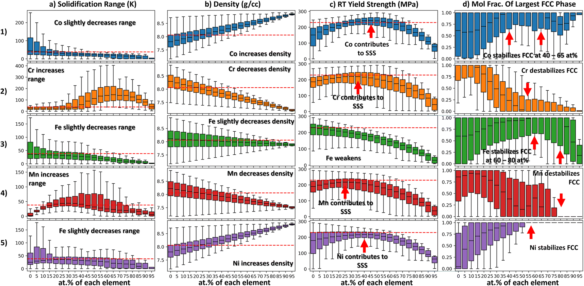 | ||
| Fig. 3 These plots summarize the property distributions using box–whisker plots as a function of individual alloying element concentrations. Each box–whisker plot shows a property distribution when a particular alloying agent is at a certain concentration. Column a shows how the solidification range varies with respect to each alloying agent. Column b shows how the density varies with respect to each alloying agent. Column c shows how the yield strength varies with respect to each alloying agent. Column d shows how the FCC phase stability varies with respect to each alloying agent. | ||
Each box–whisker plot shows the density distribution of all alloys that contain a particular amount of Cr. The first quartile is the bottom portion of the box while the third quartile is the top limit of the box. The interquartile range (IQR) is the length of the box. The ends of the box extend to the maximum and minimum values in the distribution. The diamond-shaped points beyond the whiskers are outliers. With such a plot it is possible to see how measures of center and spread related to a certain property distribution change with composition. This can be achieved in Seaborn using the boxplot function.31 In this way, the effect of alloying agents on properties can be probed quantitatively. The code associated with this toy problem is available at the following repository: https://doi.org/10.24433/CO.7775216.v1.
2.3 Compositional heatmaps
Perhaps the simplest method to visualize composition–property relationships within MPEA spaces is compositional heatmaps. When compositions are presented in tabular formats, it is helpful to add color to each cell to help the viewer recognize a sense of magnitude and scale. This can be achieved with functions as simple as conditional formatting in spreadsheet software such as Microsoft Excel.32 A similar technique is implemented in the visualization software Vital by Kauwe et al.33,34 In this visualization, the relative amounts of constituent elements in an alloy space are depicted as color intensity on the cells of a periodic table. An example of a simple compositional heatmap in a spreadsheet can be seen in Fig. 5b. Details on figure are provided in Section 3.1.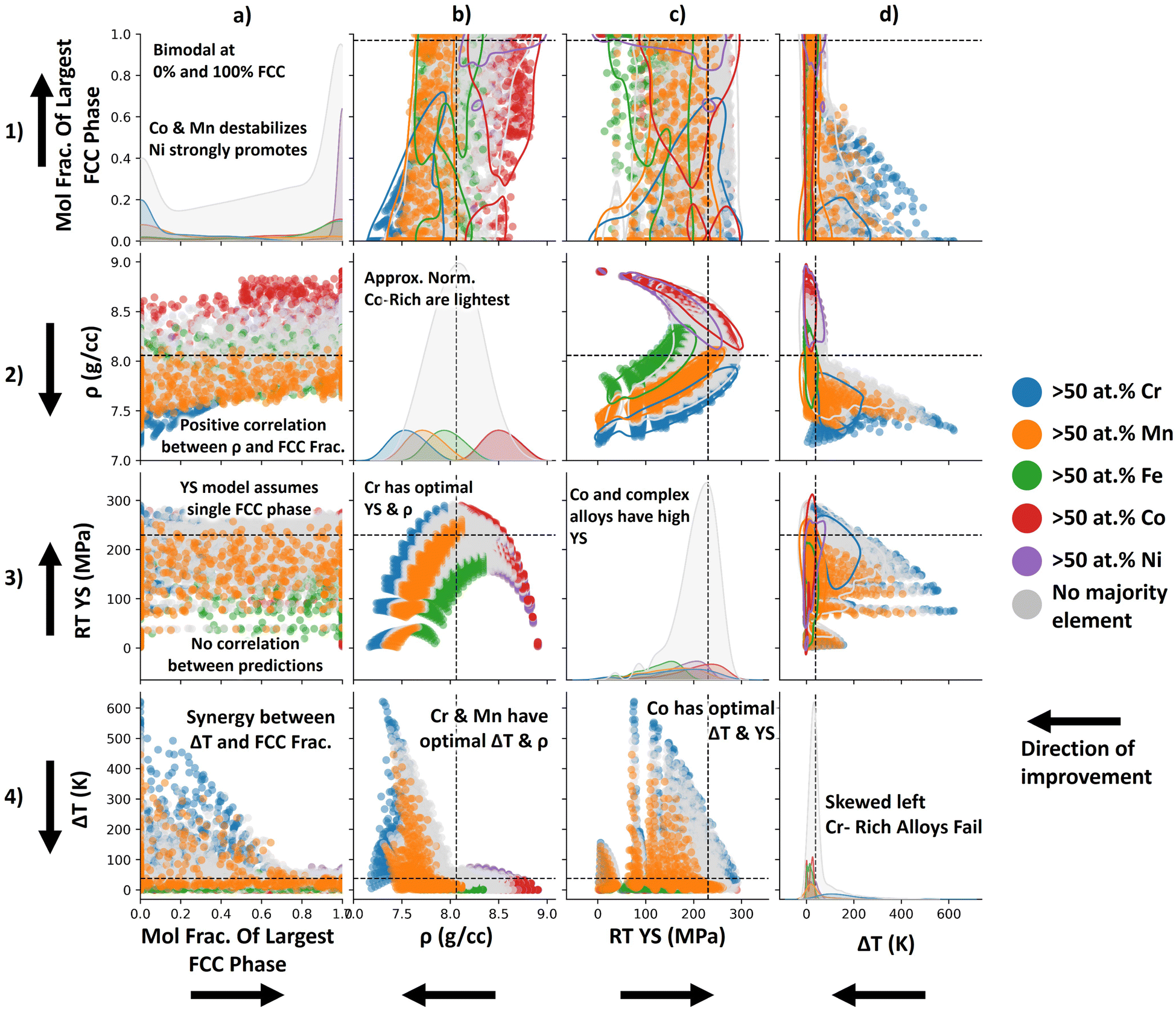 | ||
| Fig. 4 Pairwise property plot showing the chemistry-property–property relationships for this 4-constraint alloy design scheme. | ||
 | ||
| Fig. 5 (a) Chemical heatmap summarizing the composition and properties of the 13 alloys that outperform the equimolar Cantor alloy with respect to density, yield strength, solidification range, and FCC phase stability. It is evident from the compositional heatmap that the feasible alloys are rich in Mn and Cr to a lesser extent. (b) Chemical signature summarizing the composition of the 13 alloys. The Mn signature is shifted to the right indicating that these alloys are rich in Mn. The Mn signature has a large degree of spread, indicating that these 13 alloys have a range of Mn contents. The Co peak is localized around 30 at% indicating that all of the feasible alloys have Co contents near 30 at%. The other elemental signatures are shifted to the left indicating that these alloys are not rich in these elements. | ||
2.4 Chemical signatures
While compositional heatmaps are an effective way to summarize small datasets often it is desired to briefly summarize the compositions of many alloys without reporting a cumbersome list of compositions. For example, during Batch Bayesian optimization,35 it may be desired to know if candidate alloys converge to a single composition as iterations progress (see Section 3.2). The chemical signature in essence is a histogram that depicts the frequency at which certain elements appear at certain concentrations in a given subset of alloys. For ease of viewing, the underlying histograms are typically omitted and replaced with kernel density estimates (KDEs) that approximate the histograms. These KDEs create unique signature that describe the chemistry of a subset of alloys. These KDE plots can be achieved in Seaborn using the KDE function.31Consider the constraint-satisfaction MPEA design scheme presented in Section 3.1. Fig. 5b presents the compositions and properties of 13 selected alloys within the Cantor alloy space. While 13 is a manageable number of alloys to report in a compositional heatmap, if the number of alloys were in the hundreds, this would be cumbersome to visualize in a tabular format. Instead, the composition of these alloys can be summarized in a chemical signature. See Section 3.2 for a detailed interpretation of this graph.
2.5 Compositional color barcharts
Compositon heatmaps are appropriate for summarizing small datasets and chemical signatures are appropriate for summarizing the chemistries of larger datasets, however there is also a need to summarize chemistry-property relationships in an efficient way. A simple way to summarize composition vs. property relationships within MPEA spaces is compositional color barcharts. We took inspiration from ref. 36 in creating and utilizing this method in MPEAs. In compositional color barcharts a colored segment of the bar represents the mole fraction of each element in a particular alloy. Compositional color barcharts are similar to pie charts, showing the relative proportions of various elements within the alloy. However, compositional color barcharts are more interpretable than pie charts as the linear layout of compositional color barcharts allows for straightforward comparison between elements. This linear layout also makes it easy to compare the compositions of a set of alloys. Compositional color barcharts may be stacked and ordered according to a quantity of interest such as MPEA properties. In this way the effect chemistry-property relationships can be visualized.Fig. 7 shows the compositions and predicted yield strength of the first 50 alloys tested during a Bayesian optimization campaign detailed in Section 3.2. These charts are particularly useful when probing the effect of 2 alloying agents on a property of interest. For better interpretability, the Cr segment is plotted on the far most left and the W segment is plotted on the far most right. In this way we see how Cr and W increase and decrease as a function of iteration in a BO scheme (Fig. 7a) or as a function of yield strength (Fig. 7b). For more details see Section 3.2.
 | ||
| Fig. 6 Visualization of in silico Bayesian optimization campaign of the Maresca–Curtin model within the Cr–Nb–Mo–Ta–V–W alloy design space. In ITR 11 the GPR surrogate model is a poor emulator of the ground-truth (the Maresca–Curtin YS model). The uncertainty from the GPR model at ITR 11 is also high, as indicated by the dark coloring on the affine projection. The acquisition function at ITR 11 indicates that many candidate alloys still merit investigation. At ITR 25 the GPR surrogate has improved. Furthermore, the uncertainty in the GPR model has decreased. Likewise, in ITR 25 the acquisition function indicates that Mo–Cr-rich alloys and Cr–W-rich alloys merit investigation. By ITR 42, there is little improvement to the GPR surrogate and the uncertainty has been decreasing over the entire design space. The acquisition function indicates that there are no longer alloys that merit investigation. ITR: iteration. YS: yield strength. 1σ: One standard deviation. EI: expected improvement. | ||
 | ||
| Fig. 7 Compositional color bar map of compositions in Fig. 6, organized by test order and by property order. The maximum is noted with a ‘+’. It is evident from the left panel that the BO scheme first investigates Cr-rich alloys, then alloys that are rich in Cr and W, and finally begins exploring the space in later iterations. Specifically, the BO scheme investigates alloys that are more rich in Mo. In the right panel where alloys are sorted by objective it is evident that Cr–Ta–W ternaries have the highest yield strength according to the Maresca–Curtin model. | ||
2.6 Pairwise property plots
The aforementioned methods are useful for visualizing chemistry vs. property relationships, however techniques are also needed to visualize property–property relationships in high dimensional chemical spaces. Pairwise plots consist of a matrix of panels, each combination of which shows a different property–property plot. Pairwise plots have been used extensively in alloy design to show property–property relationships25,37–40 however these plots typically do not provide any insight about which compositions have good/bad combinations of properties. To address this we propose modifying pairwise scatter plots by coloring alloys according to their majority element. With this modification, pairwise property plots show both property–property relationships and chemistry-property–property relationships. One such pairwise plot is shown in Fig. 4 where the relationship between 2 properties receives a panel in a 4 × 4 matrix. Alloy chemistry is denoted on the color-axis.3 Results
These techniques can be used to visualize structure–property relationships across high-dimensional spaces in an intuitive way. While the tools in Methods are not comprehensive, we believe this suite of visualization techniques is extremely useful when analyzing MPEA design spaces. This section provides a series of case studies utilizing these techniques which showcase a unique material class and property of interest.3.1 Constraint-satisfaction in MPEA designs spaces
Abu-Odeh et al.41 showed that the design of high entropy alloys can be framed as a constraint-satisfaction problem. In constraint-satisfaction design schemes, constraints are applied to an alloy space. The set of alloys that satisfy all constraints is deemed ‘feasible.’ When applying constraints to high-dimensional alloy design spaces it is difficult to visualize which alloys pass/fail certain constraints. In previous work42 we addressed this visualization challenge by using alloy space projections. Specifically, we designed RHEAs for various applications by framing HEA design as a constraint-satisfaction problem. We plot which alloys pass/fail certain constraints on UMAP projections of the design space. In this way, we have a visual summary of the effect of various constraints on the final downselected chemistries. Furthermore we plot the feasible space on UMAPs to show where the ‘feasible’ region lies in the HEA design space. This section will demonstrate how alloy space affine projections (and several other visualization tools) can be used during constraint-satisfaction HEA design schemes.Consider a simple in silico constraint-satisfaction design scheme to identify a set of alloys within the Cantor alloy space that exhibit superior properties compared to a benchmark alloy. In this example, the benchmark alloy is the equimolar Cantor alloy, CoCrFeMnNi. The alloy space is grid-sampled at 5 at% intervals, considering unary to quinary alloys, resulting in 10![[thin space (1/6-em)]](https://www.rsc.org/images/entities/char_2009.gif) 621 candidate alloys in total. This design scheme aims to identify a set of alloys that meet the following criteria: (1) single-phase FCC crystal structures at room temperature (RT) for high-temperature operation, (2) low density, (3) narrow solidification range to avoid processing issues, and (4) high yield strength at RT for high-temperature performance. Specifically, feasible alloys must have a predicted single FCC phase fraction of ≥0.99, a density less than 8.02 g cm−3, a solidification range less than 38 K, and a room temperature yield strength greater than 230 MPa.
621 candidate alloys in total. This design scheme aims to identify a set of alloys that meet the following criteria: (1) single-phase FCC crystal structures at room temperature (RT) for high-temperature operation, (2) low density, (3) narrow solidification range to avoid processing issues, and (4) high yield strength at RT for high-temperature performance. Specifically, feasible alloys must have a predicted single FCC phase fraction of ≥0.99, a density less than 8.02 g cm−3, a solidification range less than 38 K, and a room temperature yield strength greater than 230 MPa.
The density, phase stability, and solidification range of candidate alloys are predicted using Thermo-Calc's equilibrium CALPHAD simulation.43 The simulation is conducted using the TCHEA6 database which is appropriate for HEA design spaces, such as the Cantor alloy space. The RT yield strength was predicted using the analytical Varvenne–Curtin model.44 The Varvenne–Curtin model has been widely used by the HEA community to predict the temperature-dependent yield strength of FCC HEAs.45–49 The model is a modification of the theory put forth by Leyson et al.50 Specifically, the Varvenne–Curtin model assumes that the rugged energy landscape (at the atomic scale) in HEAs will attract/pin edge-dislocation, hindering their movement through the matrix. The glide of these edge dislocations (and thus softening of the alloy) is facilitated by higher temperatures.
Fig. 2 shows the results of this constraint-satisfaction design scheme. The equimolar CoCrFeMnNi alloy (benchmark) is depicted as a dark red star in each affine projection. Its location in the affine projection is intuitive as this equimolar composition lies at the center of the Gibbs hyper-tetrahedron created by this alloy space. Fig. 2a.1 shows the density constraint plotted on a affine projection of the CoCrFeMnNi alloy space. Alloys that nearly fail/barely pass the density constraint are colored in red while alloys with low density are colored in blue. In this figure it is clear that Co- and Ni-rich alloys fail this constraint. This makes sense as Co and Ni have the highest densities in the elemental pallet. Fig. 2a.2 shows the solidification range constraint. Cr-rich alloys fail this constraint frequently, as reflected in the alloy space map where the Cr-rich region is grey. This makes sense as Cr has a significantly higher melting temperature than the other elements in the pallet. Furthermore, it is evident that compositional complex alloys plotted in the central regions of the affine projection have wider solidification ranges than compositionally simple alloys plotted near the edges and vertices of the affine projection. Fig. 2a.3 shows the RT yield strength constraint. In this projection, compositionally complex alloys have a higher predicted yield strength than compositionally simple alloys. This makes sense as the Varvenne–Curtin model is a solid solution strengthening model. Furthermore, alloys rich in Ni and Cr have higher predicted yield strengths. Fig. 2a.4 shows the RT single-phase FCC constraint. Alloys that pass this binary constraint are colored in blue whereas alloys that fail are colored in grey. Alloys rich in Mn and Cr tend to fail this phase constraint, and this is reflected in Fig. 2a.4. This makes sense as Mn and Cr are BCC formers.
Fig. 2b shows the union of these constraints applied to the CoCrFeMnNi design space. When the union of constraints is considered, only 13 alloys are feasible. That is to say, only 13 alloys outperform the equimolar Cantor alloy with respect to the 4 properties of interest. These feasible alloys are compositionally complex and lie in the Fe and Mn-rich region of the design space. In this way, projections can provide a summary of how certain constraints affect the resultant feasible chemistry space. However, affine projections alone are not sufficient to visualize chemistry-property relationships in HEA design spaces.As a reminder, overcrowding during affine projection occurs when certain alloys are mapped so closely together that they overlap, obscuring other alloys that may have been filtered. This limitation is further discussed in the ESI.† This makes it difficult to obtain a quantitative summary of composition–property relationships, limiting the analysis to a more qualitative understanding. As a result, relying solely on UMAP projections is insufficient for effectively visualizing the correlation between alloy chemistry and properties.
Another method of visualizing chemistry-property relationships is compositional box–whisker plots (as described in Section 2.2). These plots probe the effect of individual alloying agents on property. The x-axis of each panel in Fig. 3 is the mole fraction of a particular element. When the alloy space is uniformly grid sampled, elements appear at discrete concentration intervals e.g. at 5 at% intervals in the case of Fig. 3. A box–whisker graph is plotted over each interval. These box–whisker plots summarize the property distribution of all alloys that have an element at that specific mole fraction. For example, Fig. 31.b shows the effect of varying Co on the density. The box–whisker plot centered over 0 at% in Fig. 31.b shows the density distribution of all alloys that do not contain Co. Likewise, the box–whisker plot centered over 95 at% shows the distribution of all alloys that contain 95 at% Co. As chemistry varies along the x-axis the property distribution will vary. In this way we can visually summarize trends between properties and chemistry using simple statistical visualization.
In Fig. 3 Column A the solidification range distributions are shown. From Column A it is evident that Co, Fe, and Ni slightly decrease the solidification range of the alloy system. Conversely, Cr and Mn additions increase the solidification range at certain concentrations. However, Cr causes the largest increase in the solidification range by far. This observation is in agreement with Fig. 2a.2 where the Cr-rich region of the affine projection is colored in grey, indicating that class of alloys frequently fails the solidification range constraint.
In Fig. 3 Column B the density distributions are shown. The trends in this column are linear and easy to interpret as density is known to be accurately predicted using the rule of mixtures. Ni and Co tend to increase the density of Cantor alloys whereas Cr and Mn tend to decrease the density of Cantor alloys. Fe only has a slight effect on density. The IQRs of the density distributions become more narrow as the alloys become richer in a particular element. The density distributions at 95 at% are the most narrow because there are only 4 alloys in each distribution and they are all rich in a particular element and thus have similar densities.
In Fig. 3 Column C the RT yield strength distributions are shown. From Column C it is evident that some elements contribute to solid solution strengthening (e.g. Co, Cr, Mn, Ni) and some elements do not (e.g. Fe). Regarding the elements that do contribute to SSS, these distributions can help us determine the optimal content of each element to achieve SSS. For example, regarding Co, the median yield strength of alloys is maximized when Co content is at 45 at%. Similarly, for Cr this occurs at 35 at%. Furthermore, we can see which element has the greatest strengthening effect. From Figure Fig. 3 1.c, it is evident that Co is the most potent strengthener. This is because in the range of 30 to 55 at% Co content, the median yield strength is greater than 230 MPa. This is the only element in the design space whose addition causes the median yield strength to exceed 230 MPa over such a wide window of compositions. This is also reflected in Fig. 2a.3 as there are some Co-rich alloys in the feasible region in the affine projection.
In Fig. 3 Column D, the RT single FCC phase fraction distributions are shown. From this figure we see Ni is the most potent FCC stabilizer in the elemental pallet. This is because beyond a Ni content of 55 at% all alloys are predicted to have a single FCC phase at RT. Co also promotes a single FCC phase at concentrations between 40 and 65 at%. Likewise, Fe promotes a single FCC phase at concentrations between 60 and 80 at%. Cr and Mn destabilize the FCC phase. These results are in agreement with the affine projection in Fig. 2a.4.
We have visualized the chemistry property relationships using affine projections and compositional box–whisker plots. In this section we will use pairwise property plots to visualize property–property relationships. Fig. 4 shows the pairwise property plot for the CoCrFeMnNi alloy space. Alloys that have 50 at% or more of a particular element are colored according to the legend in the margin of Fig. 4. The diagonal panels in Fig. 4 depict individual property distributions. The off-diagonal panels depict property–property relationships. Constraints on the properties are depicted with a dashed line.
Regarding individual property distributions, Fig. 4a.1 shows the mole fractions distributions of the largest FCC phases present in the candidate alloys i.e. if the mole fraction of the largest FCC phase present in a candidate alloy is 100 at%, the alloy has a single FCC phase. The distribution in Fig. 4a is bimodal with peaks at 0 at% FCC phase and 100 at% FCC phase. The strong peak of alloys that have >50 at% Ni around 100 at% FCC phase indicates that Ni-rich alloys are likely to be FCC. This is in agreement with Fig. 2 and 3 where it was determined that Ni was the most potent FCC promoter in the elemental pallet. Cr (and to a lesser extent Mn) destabilize the FCC phase and thus Cr- and Ni-rich alloys have peaks at 0 at% FCC phase.
Fig. 4b.2 shows the density distributions of candidate alloys. These distributions are all approximately normal. For alloys with a majority element, these density distributions have a mean centered around the density of the pure element. For alloys without a majority element (colored in grey) the density distribution is centered around the density of the equimolar Cantor alloy. The Co-rich density distribution is shifted the farthest to the right indicating that Co-rich alloys are denser whereas the Cr-rich density distribution is shifted the farthest to the left, indicating that Cr-rich alloys are less dense. Few Co-rich alloys pass the density constraint. Alloys on the right side of the Fe-rich distribution fail the constraint. The tail of the Mn distributions fails the constraint. Most of the alloys in the Cr-rich distribution pass the constraint.
Fig. 4c.3 shows the RT yield strength distributions of candidate alloys. These distributions appear to be left-skewed and log-normal. This constraint filters alloys that have a majority alloying element (e < 50 at%). For example, the means of the Ni-, Fe-, Mn-, and Cr-rich yield strength distributions fall below the 230 MPa yield strength constraint. The Co-rich distribution has the most area that falls on the right of the 230 MPa yield strength constraint, indicating that Co-rich alloys have higher yield strengths (according to the Varvenne–Curtin model).
Fig. 4d.4 shows the solidification range distributions of candidate alloys. These distributions appear to be approximately log-normal. For example, the Mn-rich solidification range distribution appears to be log-normal. Likewise, the no-majority-element solidification range has a log-normal distribution. The distributions of Co, Fe, and Ni, however, have slightly asymmetric tails which might suggest log-normality however these distributions are multi-modal and, therefore cannot be truly log-normal. Cr-rich and no-majority-element alloys fail this constraint frequently. The alloys in the right-side tails of the Mn- and Ni-rich distributions also tend to fail this constraint.
Row 4 shows the relationship between the solidification range and the remaining 3 properties. According to Fig. 4a.4, there is a synergy between the solidification range and FCC phase fraction in candidate alloys i.e. as the mole fraction of the largest FCC phase increases the solidification range decreases. Regarding the relationship between solidification range and density in Fig. 4b.4 there is a slight trade-off i.e. as density decreases, the solidification range will tend to increase. Despite this trade-off, Cr- and Mn-rich alloys (and to a lesser extent Fe-rich alloys) have an optimal combination of solidification range and density. Regarding the relationship between solidification range and RT yield strength in Fig. 4c.4, a trade-off exists i.e. as the yield strength prediction from the Varvenne–Curtin model increases the solidification range will also increase. This is because the Varvenne–Curtin model is a solid solution strengthening model. As the chemical complexity increases the yield strength will increase, but to the detriment of the solidification range.
Row 3 shows the relationship between the RT yield strength and the other properties of interest. There does not appear to be any correlation between the yield strength prediction from the Varvenne–Curtin model and the mole fraction of single FCC phases present in the alloys in Fig. 4a.3. This lack of correlation may be because the Varvenne–Curtin model is only suitable for single phase FCC solid solutions. The relationship between yield strength and density follows a negative parabolic relationship in Fig. 4b.3. This parabolic relationship is likely because the Varvenne–Curtin model is a solid solution strengthening model. The yield strength will increase for compositionally complex alloys. These compositionally complex alloys have densities that fall between the densities of their constituent elements, thus the yield strength is maximized when the density is the average density (ρ = 8.02 g cm−3). The relationship between yield strength and solidification range is described in the previous paragraph.
Row 2 shows the relationship between the density and the other properties of interest. As shown in Fig. 4a.2, there exists a slight positive correlation between density and the mole fraction of single FCC phases present in the alloys. The relationships between density and strength and density and solidification range are described in the previous paragraphs.
Once the effects of the filters have been probed, the chemistry of the downselected space can be analyzed. Fig. 5 shows different visualizations that summarize the compositions of alloys that pass all the constraints applied in this case study i.e. the set of alloys that outperform the equimolar Cantor alloy with respect to all properties of interest. While 13 alloys is manageable to consider, in many alloy design scenarios the feasible space can be 214 alloys (see ref. 42). Therefore techniques that summarize a set of compositions are relevant for alloy design.
Fig. 5a is a compositional heatmap. Specifically, the 13 alloys that outperform the cantor alloy with respect to the 4 properties of interest are summarized in tabular form. The cells that contain the composition of each element in the alloy are colored according to their relative amount in the alloy i.e. cells with 60 at% are assigned dark orange and cells containing 0 at% are colored white. The 4 properties of interest are also tabulated i.e. the density, yield strength, solidification range, and 700 °C FCC phase fraction. Each cell in the property column is colored according to its property value. Good values are colored blue and bad values are colored red. For example, in the density column, alloys with the highest density are colored red and alloys with the lowest density are colored blue. In Fig. 5a it is evident that the 13 alloys that outperform the equimolar cantor alloy are rich in Mn and to a lesser extent Co. This is in agreement with the affine projection in Fig. 2.
Another method of summarizing the composition of these alloys is the chemical signature shown in Fig. 5b. In this figure the frequency at which elements appear at certain concentrations in an alloy is plotted. For example, in this plot we see that if Co appears in the feasible set of alloys, it will appear at concentrations between 15 at% and 40 at%. Likewise it is evident that many of these 13 feasible alloys are rich in Mn. Cr is the least represented element in the feasible space because the Cr KDE is shifted the farthest to the left, toward lower concentrations.
3.2 Optimization in MPEA designs spaces
Often in optimization problems, the dimensionality of the design space makes visualization difficult. In 1D optimization problems Bayesian optimization can be visualized by plotting the output of a surrogate function (typically a Gaussian Process Regressor). Uncertainties associated with these GPR predictions are typically plotted as shaded regions above and below the prediction from the surrogate model. Typically in the case of GPRs, a 2σ credible interval is created around the mean prediction from the GPR.51 For ternary systems, the surrogate prediction and the uncertainty in the prediction can be plotted on ternary diagrams. Visualization beyond ternary systems becomes cumbersome. As previously shown, affine projections offer a method to visualize properties over high dimensional alloy spaces. In the same way, we can visualize the progress of Bayesian optimization schemes in high dimensional alloy spaces using affine projections. In addition to projections, in this section we will showcase other visualization techniques that are pertinent to alloy design and Bayesian optimization.Consider a simple sequential Bayesian optimization scheme with the goal of identifying a set of alloys within the CrNbMoTaVW chemistry space with the highest yield strength as predicted by the Maresca–Curtin model.52 The Maresca–Curtin model has been widely used by the MPEA community to predict yield strength. The Maresca–Curtin model relies on the fact that the random strain fields inherent to MPEAs create a rugged energy landscape that edge dislocations must overcome via thermally activated edge glide. A full derivation of the model is provided in ref. 52.
In this optimization scheme, we grid sample the CrNbMoTaVW alloy space at 5 at% considering unary to quinary alloys. This sampling results in a grid of 53130 candidate alloys. The goal of the optimization scheme is to locate the alloy with the highest predicted yield strength while minimizing the number of times the Maresca–Curtin model is queried. The GPR surrogate model in this BO scheme is equipped with an additive kernel composed of the anisotropic Radial Basis Function (RBF) kernel and the white noise kernel. The RBF kernel is employed as it is the most common kernel used in GPRs when no prior physics is assumed during modeling. The length scales of the RBF kernel are tuned based on the maximum likelihood as more data is acquired however the length scales are bounded between 2 at% and 100 at%. The white kernel is added to account for any uncorrelated noise in the data. This kernel is shown in eqn (1). The acquisition function used in the BO scheme is the commonly used expected improvement (EI) metric.3 This metric quantifies the expected positive difference in yield strength between any candidate alloy (as predicted with the GPR surrogate) and the alloy with the current highest yield strength (as predicted with the Maresca–Curtin model).
 | (1) |
Fig. 6 demonstrates the progression of the BO scheme. The first column of affine projections represent the objective (yield strength) as predicted using the surrogate function. This represents the current belief about how yield strength varies with chemistry, given the current set of observed data. Green regions represent alloys whose yield strengths are predicted to be higher while red regions represent alloys whose yield strengths are predicted to be lower. In the 11th iteration, the GPR is insufficiently trained and provides a poor approximation of the Maresca–Curtin yield strength. By the 25th iteration the model has improved its model of the Maresca–Curtin yield strength and has found the global optimum (represented by the pink star). The GPR predicts that alloys rich in W and Cr have the highest yield strength. Furthermore, the GPR predicts that pure elements have the lowest yield strength, represented by the red vertices and edges on the affine projection. This is reasonable as the Maresca–Curtin is a solid solution strengthening model. By the 42nd iteration there is little change to the objective model and the BO scheme focuses the majority of its queries on the W- and Cr-rich regions of the alloy space.
The second column represents the uncertainty associated with the prediction from the GPR. Dark regions in the affine projection represent sets of alloys where the GPR is uncertain in its predictions of yield strength. Brighter regions represent sets of alloys where the GPR is less uncertain in its predictions of yield strength. Regions in the alloy space where observations are sparse are thus darker. This is because there is no training data that is compositionally similar to those alloys and the GPR is more uncertain in its predictions. Regions in the alloy space where there are sufficient observations are colored lighter as there is sufficient training data available for these alloys. In the 11th iteration the model is uncertain about its predictions in this design space, and thus the affine projection is colored darker. In the 25th iteration the model is less uncertain about its predictions in the regions near the optimum. This is because, by design, the BO scheme will attempt to focus its queries on the region near the optimum. Fewer queries are made in the V-, Mo-, and Cr-rich regions, indicating that the BO scheme has not sufficiently explored these alloy families. By the 42nd iteration the GPR is more confident in its prediction. Most of the design space has been explored, and the region near the optimum has been exploited.
The third column represents the acquisition function (the EI) at the current iteration. The alloy with the highest EI in the current iteration is then queried at the start of the next iteration. In iteration 11 the EI is high for many alloys within the compositionally complex regions of the design space. The EI is low near the vertices and edges of the affine projection, indicating that the GPR is learning the solid solution strengthening trend in the design space. In the 25th iteration, the EI indicates that the BO scheme is interested in 2 regions in the alloy space. One region is rich in Cr and Mo while the other region is rich in Cr and W. These regions are denoted by bright red colors in the affine projection. It is worth noting that in the 25th iteration, the BO scheme has found the global optimum. Therefore no improvement in the yield strength can be made. However, the BO scheme still ‘expects’ that some alloys have a higher yield strength than the current optimum. Therefore, the optimization scheme will continue querying alloys that are expected to have a higher yield strength than the optimal. By the 42nd iteration, the EI has been decreased significantly. It is evident that there is no incentive to continue the optimization scheme as the expected yield strength improvement for all alloys is on the order of 1 MPa. These diminishing returns for subsequent experiments indicate the convergence of the BO scheme.
The affine projections in Fig. 6 provide an ‘aerial’ perspective of the multidimensional compositional space as time progresses, providing the viewer with immediate recognition of trends as optimization progresses. A more direct plot of compositions can be paired alongside these affine projections to provide quantitative information, without having to resort to a table of numbers that need significant interpretation. In Fig. 7, the compositions tested in Fig. 6 are plotted as color bars. This type of plot is particularly advantageous for systems of varying subsystems of elements, as entire degradation mechanisms may differ with the addition or subtraction of a single element. In the right half of Fig. 7, the tests are sorted by the objective. One can easily see that a particular set of elements, Cr–Ta–W, was more effective than any other combination. The left half of Fig. 7 provides some insight into the candidacy suggestion process of the Bayesian script used. Unary or binary tests 21, 23, 28, 29, 33, 34, 35, etc. show how often the optimization algorithm is willing to ‘explore’ untested regions of the phase space with its given set of hyperparameters. Test 26 reveals the highest objective value ever found; the optimization scheme obviously does not ‘know’ this, and continues to locally test the Cr–Ta–W region. It can be difficult to visualize how far away a composition is from another (in Euclidean distance) when the elements proceed to differ, which is another salient feature of the animation associated with Fig. 6, which can be found in the code repository associated with this work: https://doi.org/10.24433/CO.7775216.v1.
4 Conclusion
Visualizing high-dimensional composition spaces has been a challenge for the MPEA community. Higher-order MPEA systems cannot be represented on conventional diagrams and require more sophisticated visualization techniques. Some visualization techniques, such as pseudo ternary diagrams are helpful, but cannot probe the effect of individual alloy agents on properties. Other visualization techniques such as Schlegel diagrams and graph networks can be difficult to interpret. Therefore, a suite of intuitive visualization tools are needed for design in compositionally complex alloy spaces.In this work, we address this challenge by curating a toolkit of visualization techniques that we have found useful during MPEA design. In this work we present a comprehensive tutorial for this toolkit, detailing the best practices for these visualization techniques. Our unique contribution to this suite of visualization techniques are the many in which we use projections of alloy spaces for the purposes of design. We provide code demonstrating the utilization of various projections to visualize high dimensional barycentric design spaces (e.g. alloy spaces). We explain how these projections can be used to visualize MPEA composition–property relationships. We believe alloy space projections are significant in the context of human-in-the-loop optimization53 within chemically complex design spaces. Their intuitive nature can enable designers to effectively visualize and navigate complex decision spaces, facilitating more informed and efficient alloy design processes.
In addition to projections of barycentric design spaces, we demonstrated a suite of other visualization tools that have been used successfully to visualization chemistry-property and property–property relationships in HEA design spaces. We show cased these visualization tools in 5 unique case studies:
(1) We showed how affine projections, compositional box–whisker plots, pairwise property plots, chemical signatures, and compositional heatmaps can be used to visualize and explain constraint-satisfaction alloy design schemes from start to finish. In this way, chemistry-property, and chemistry-property–property relationships can be visualized.
(2) We showed how affine projections and compositional colorbar maps can visualize the progression of iterative Bayesian optimization schemes. To our knowledge this is the first time a Bayesian optimization scheme in 5D barycentric design space has been visualized in this manner. We believe UMAP projections of barycentric design spaces can offer useful insights into optimization in high-dimensional spaces. The evolution of surrogate model prediction, uncertainty and the acquisition function can provide designers with information about why the optimization scheme has made certain decisions. This is important for humans-in-the-loop optimization schemes.
While no single visualization technique is appropriate for all scenarios in alloy design, we believe the visualization tools presented in this work are applicable to many scenarios in alloy design and fields beyond metallurgy. We encourage the MPEA community to consider the best and most impactful ways to present their own high-dimensional data.
Data availability
The code for associated with this work can be found at URL: https://codeocean.com/capsule/7775216/tree. The associated with this capsule is DOI: https://doi.org/10.24433/CO.7775216.v1. The version of the code employed for this study is version 1.Author contributions
BV: conceptualization, formal analysis, investigation, methodology, validation, visualization, writing original draft, writing review & editing. TH: formal analysis, investigation, methodology, software, validation, visualization, writing original draft, writing review & editing. MA: supplemental topological data analysis & visualization. RA: funding acquisition, project administration, resources, supervision, validation, writing review & editing.Conflicts of interest
The authors declare that they have no known competing financial interests or personal relationships that could have appeared to influence the work reported in this paper.Acknowledgements
BV acknowledges Grant No. NSF-DGE-1545403 (NSF-NRT: Data-Enabled Discovery and Design of Energy Materials, D3EM) and Grant No. 1746932. RA acknowledge support from NSF through Grant No. DMREF-2323611. High-throughput CALPHAD calculations were carried out in part at the Texas A&M High-Performance Research Computing (HPRC) Facility.References
- J.-W. Yeh, S.-K. Chen, S.-J. Lin, J.-Y. Gan, T.-S. Chin, T.-T. Shun, C.-H. Tsau and S.-Y. Chang, Adv. Eng. Mater., 2004, 6, 299–303 CrossRef CAS.
- S. Praveen and H. S. Kim, Adv. Eng. Mater., 2018, 20, 1700645 CrossRef.
- R. Arróyave, D. Khatamsaz, B. Vela, R. Couperthwaite, A. Molkeri, P. Singh, D. D. Johnson, X. Qian, A. Srivastava and D. Allaire, MRS Commun., 2022, 12, 1037–1049 CrossRef.
- D. Miracle and O. Senkov, Acta Mater., 2017, 122, 448–511 CrossRef CAS.
- Y. Chen, B. Xie, B. Liu, Y. Cao, J. Li, Q. Fang and P. K. Liaw, Front. Mater., 2022, 8, 816309 CrossRef.
- Y. Zhang, C. Wen, P. Dang, T. Lookman, D. Xue and Y. Su, J. Mater. Sci. Technol., 2024, 200, 243–252 CrossRef.
- A. Li, P. Yu, Y. Gao, M. Dove and G. Li, J. Mater. Sci. Eng. A, 2023, 862, 144286 CrossRef CAS.
- S. Nene, M. Frank, K. Liu, S. Sinha, R. Mishra, B. McWilliams and K. Cho, Scr. Mater., 2019, 166, 168–172 CrossRef CAS.
- P. Singh, C. Acemi, A. Kuchibhotla, B. Vela, P. Sharma, W. Zhang, P. Mason, G. Balasubramanian, I. Karaman and R. Arroyaveet al., 2024, Available at SSRN 4723754.
- V. A. Bykov, T. V. Kulikova, I. S. Sipatov, E. V. Sterkhov, D. A. Kovalenko and R. E. Ryltsev, Crystals, 2023, 13, 1567 CrossRef CAS.
- S. Vrtnik, S. Guo, S. Sheikh, A. Jelen, P. Koželj, J. Luzar, A. Kocjan, Z. Jagličić, A. Meden, H. Guim, H. Kim and J. Dolinšek, Intermetallics, 2018, 93, 122–133 CrossRef CAS.
- M. Aykol, V. I. Hegde, L. Hung, S. Suram, P. Herring, C. Wolverton and J. S. Hummelshøj, Nat. Commun., 2019, 10, 1–7 CrossRef CAS PubMed.
- D. Evans, J. Chen, G. Bokas, W. Chen, G. Hautier and W. Sun, npj Comput. Mater., 2021, 7, 151 CrossRef CAS.
- A. van de Walle, H. Chen, H. Liu, C. Nataraj, S. Samanta, S. Zhu and R. Arroyave, JOM, 2022, 74, 3478–3486 CrossRef.
- L. Van der Maaten and G. Hinton, J. Mach. Learn. Res., 2008, 9, 2579–2605 Search PubMed.
- L. McInnes, J. Healy and J. Melville, arXiv preprint arXiv:1802.03426, 2018 Search PubMed.
- Z. Li and N. Birbilis, Integr. Mater. Manuf. Innov., 2024, 1–10 Search PubMed.
- B. Vela, S. Mehalic, S. Sheikh, A. Elwany, I. Karaman and R. Arróyave, Addit Manuf., 2022, 3, 100085 Search PubMed.
- E. Amid and M. K. Warmuth, arXiv preprint arXiv:1910.00204, 2019 Search PubMed.
- F. Gunsilius and S. Schennach, J. Am. Stat. Assoc., 2023, 118, 1305–1318 CrossRef CAS.
- W. Jiang, D. Yu, Z. Xie, Y. Li, Z. Yuan and H. Lu, Comput. Vis. Image Underst., 2023, 230, 103645 CrossRef.
- T. Z. Khan, T. Kirk, G. Vazquez, P. Singh, A. Smirnov, D. D. Johnson, K. Youssef and R. Arróyave, Acta Mater., 2022, 224, 117472 CrossRef CAS.
- C. Acemi, B. Vela, E. Norris, W. Trehern, K. C. Atli, C. Cleek, R. Arroyave and I. Karaman, Acta Mater., 2024, 120379 CrossRef CAS.
- B. Vela, C. Acemi, P. Singh, T. Kirk, W. Trehern, E. Norris, D. D. Johnson, I. Karaman and R. Arróyave, Acta Mater., 2023, 248, 118784 CrossRef CAS.
- D. Khatamsaz, B. Vela, P. Singh, D. D. Johnson, D. Allaire and R. Arróyave, npj Comput. Mater., 2023, 9, 49 CrossRef CAS.
- M. Mulukutla, R. Robinson, D. Khatamsaz, B. Vela, N. Vu and R. Arróyave, arXiv preprint arXiv:2409.15391, 2024 Search PubMed.
- C. T. Loop and T. D. DeRose, ACM Trans. Graph, 1989, 8, 204–234 CrossRef.
- M. Meyer, A. Barr, H. Lee and M. Desbrun, J. Graph. Tools., 2002, 7, 13–22 CrossRef.
- Y. Wang, H. Huang, C. Rudin and Y. Shaposhnik, J. Mach. Learn. Res., 2021, 22, 1–73 Search PubMed.
- S. Waldron, Jaen J. Approx., 2011, 3, 209–226 Search PubMed.
- M. L. Waskom, J. Open Source Softw., 2021, 6, 3021 CrossRef.
- Use Conditional Formatting to Highlight Information in Excel, 2021, https://bit.ly/3X2kjAt, Accessed: 2024-05-01.
- S. Kauwe, Y. Yang and T. Sparks, Visualization Tool for Atomic Models (VITAL): A Simple Visualization Tool for Materials Predictions, ChemRxiv, 2019 Search PubMed.
- F. Belviso, V. E. Claerbout, A. Comas-Vives, N. S. Dalal, F.-R. Fan, A. Filippetti, V. Fiorentini, L. Foppa, C. Franchini and B. Geisler, et al. , Inorg. Chem., 2019, 58(22), 14939–14980 CrossRef CAS PubMed.
- T. T. Joy, S. Rana, S. Gupta and S. Venkatesh, Knowl.-Based Syst., 2020, 187, 104818 CrossRef.
- T. Erps, M. Foshey, M. K. Luković, W. Shou, H. H. Goetzke, H. Dietsch, K. Stoll, B. von Vacano and W. Matusik, Sci. Adv., 2021, 7, eabf7435 CrossRef CAS PubMed.
- H. Yang, J. Zhao, Q. Wang, B. Liu, W. Luo, Z. Sun and T. Liao, arXiv preprint arXiv:2402.03876, 2024 Search PubMed.
- U. K. Jaiswal, Y. Vamsi Krishna, M. Rahul and G. Phanikumar, Comput. Mater. Sci., 2021, 197, 110623 CrossRef CAS.
- S. Gao, Z. Gao and F. Zhao, Mater. Today Commun., 2023, 35, 105894 CrossRef CAS.
- D. Khatamsaz, B. Vela, P. Singh, D. D. Johnson, D. Allaire and R. Arróyave, Acta Mater., 2022, 236, 118133 CrossRef CAS.
- A. Abu-Odeh, E. Galvan, T. Kirk, H. Mao, Q. Chen, P. Mason, R. Malak and R. Arróyave, Acta Mater., 2018, 152, 41–57 CrossRef CAS.
- B. Vela, C. Acemi, P. Singh, T. Kirk, W. Trehern, E. Norris, D. Johnson, I. Karaman and R. Arróyave, Acta Mater., 2023, 248, 118784 CrossRef CAS.
- J.-O. Andersson, T. Helander, L. Höglund, P. Shi and B. Sundman, Calphad, 2002, 26, 273–312 CrossRef CAS.
- C. Varvenne, A. Luque and W. A. Curtin, Acta Mater., 2016, 118, 164–176 CrossRef CAS.
- M. Schneider, E. George, T. Manescau, T. Záležák, J. Hunfeld, A. Dlouhý, G. Eggeler and G. Laplanche, Int. J. Plast., 2020, 124, 155–169 CrossRef CAS.
- E. Menou, I. Toda-Caraballo, P. E. J. R.-D. del Castillo, C. Pineau, E. Bertrand, G. Ramstein and F. Tancret, Mater. Des., 2018, 143, 185–195 CrossRef CAS.
- D. de Araujo Santana, C. S. Kiminami and F. G. Coury, J. Alloys Compd., 2022, 898, 162923 CrossRef CAS.
- B. Yin, S. Yoshida, N. Tsuji and W. Curtin, Nat. Commun., 2020, 11, 2507 CrossRef CAS PubMed.
- Z. Pei, J. Yin, P. K. Liaw and D. Raabe, Nat. Commun., 2023, 14, 54 CrossRef CAS PubMed.
- G. Leyson and W. Curtin, Modell. Simul. Mater. Sci. Eng., 2016, 24, 065005 CrossRef.
- R. Garnett, Bayesian Optimization, Cambridge University Press, 2023 Search PubMed.
- F. Maresca and W. A. Curtin, Acta Mater., 2020, 182, 235–249 CrossRef CAS.
- A. G. Kusne, H. Yu, C. Wu, H. Zhang, J. Hattrick-Simpers, B. DeCost, S. Sarker, C. Oses, C. Toher and S. Curtarolo, et al. , Nat. Commun., 2020, 11, 5966 CrossRef CAS PubMed.
Footnote |
| † Electronic supplementary information (ESI) available. See DOI: https://doi.org/10.1039/d4dd00262h |
| This journal is © The Royal Society of Chemistry 2025 |