 Open Access Article
Principal component analysis
Rasmus
Bro
a and
Age K.
Smilde
ab
aDepartment of Food Science, University of Copenhagen, Rolighedsvej 30, DK-1958, Frederiksberg C, Denmark
bBiosystems Data Analysis, Swammerdam Institute for Life Sciences, University of Amsterdam, Science Park 904, 1098 XH Amsterdam, The Netherlands
First published on 24th March 2014
Abstract
Principal component analysis is one of the most important and powerful methods in chemometrics as well as in a wealth of other areas. This paper provides a description of how to understand, use, and interpret principal component analysis. The paper focuses on the use of principal component analysis in typical chemometric areas but the results are generally applicable.
Introductory example
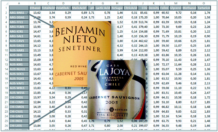
To set the stage for this paper, we will start with a small example where principal component analysis (PCA) can be useful. Red wines, 44 samples, produced from the same grape (Cabernet sauvignon) were collected. Six of these were from Argentina, fifteen from Chile, twelve from Australia and eleven from South Africa. A Foss WineScan instrument was used to measure 14 characteristic parameters of the wines such as the ethanol content, pH, etc. (Table 1).| Ethanol (vol%) |
| Total acid (g L−1) |
| Volatile acid (g L−1) |
| Malic acid (g L−1) |
| pH |
| Lactic acid (g L−1) |
| Rest sugar (Glu + Fru) (g L−1) |
| Citric acid (mg L−1) |
| CO2 (g L−1) |
| Density (g mL−1) |
| Total polyphenol index |
| Glycerol (g L−1) |
| Methanol (vol%) |
| Tartaric acid (g L−1) |
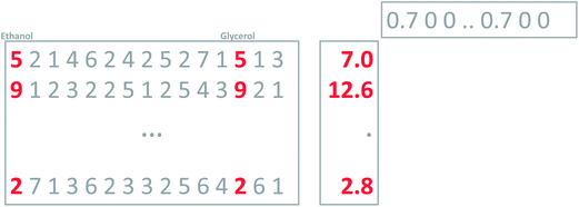
Hence, a dataset is obtained which consists of 44 samples and 14 variables. The actual measurements can be arranged in a table or a matrix of size 44 × 14. A portion of this table is shown in Fig. 1.
With 44 samples and 14 columns, it is quite complicated to get an overview of what kind of information is available in the data. A good starting point is to plot individual variables or samples. Three of the variables are shown in Fig. 2. It can be seen that total acid as well as methanol tends to be higher in samples from Australia and South Africa whereas there are less pronounced regional differences in the ethanol content.
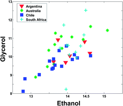
Even though Fig. 2 may suggest that there is little relevant regional information in ethanol, it is dangerous to rely too much on univariate analysis. In univariate analysis, any co-variation with other variables is explicitly neglected and this may lead to important features being ignored. For example, plotting ethanol versus glycerol (see Fig. 3) shows an interesting correlation between the two. This is difficult to deduce from plots of the individual variables. If glycerol and ethanol were completely correlated, it would, in fact, be possible to simply use e.g. the average or the sum of the two as one new variable that could replace the two original ones. No information would be lost as it would always be possible to go from e.g. the average to the two original variables.
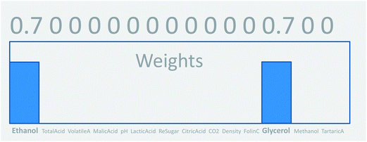
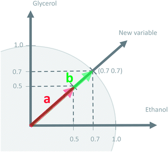
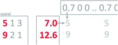
This concept of using suitable linear combinations of the original variables will turn out to be essential in PCA and is explained in a bit more detail and a slightly unusual way here. The new variable, say, the average of the two original ones, can be defined as a weighted average of all 14 variables; only the other variables will have weight zero. These 14 weights are shown in Fig. 4. Rather than having the weights of ethanol and glycerol to be 0.5 as they would in an ordinary average, they are chosen as 0.7 to make the whole 14-vector of weights scaled to be a unit vector. When the original variables ethanol and glycerol are taken to be of length one (unit length) then it is convenient to also have the linear combination of those to be of length one. This then defines the unit on the combined variable. To achieve this it is necessary to take 0.7 ( to be exact) of ethanol and 0.7 of glycerol, as simple Pythagorean geometry shows in Fig. 5. This also carries over to more than two variables.
Using a unit weight vector has certain advantages. The most important one is that the unit vector preserves the size of the variation. Imagine there are ten variables rather than two that are being averaged. Assume, for simplicity that all ten have the value five.
Regardless of whether the average is calculated from two or ten variables, the average remains five. Using the unit vector, though, will provide a measure of the number of variables showing variation. In fact, the variance of the original variables and this newly calculated one will be the same, if the original variables are all correlated. Thus, using the unit vector preserves the variation in the data and this is an attractive property. One of the reasons is that it allows for going back and forth between the space of the original variables (say glycerol–ethanol) and the new variable. With this definition of weights, it is now possible to calculate the new variable, the ‘average’, for any sample, as indicated in Fig. 6.
As mentioned above, it is possible to go back and forth between the original two variables and the new variable. Multiplying the new variable with the weights provides an estimation of the original variables (Fig. 7).
This is a powerful property; that it is possible to use weights to condense several variables into one and vice versa. To generalize this, notice that the current concept only works perfectly when the two variables are completely correlated. Think of an average grade in a school system. Many particular grades can lead to the same average grade, so it is not in general possible to go back and forth. To make an intelligent new variable, it is natural to ask for a new variable that will actually provide a nice model of the data. That is, a new variable which, when multiplied with the weights, will describe as much as possible the whole matrix (Fig. 8). Such a variable will be an optimal representative of the whole data in the sense that no other weighted average simultaneously describes as much of the information in the matrix.
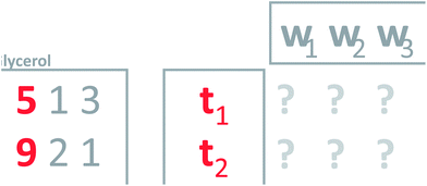 | ||
| Fig. 8 Defining weights (w's) that will give a new variable which leads to a good model of the data. | ||
It turns out that PCA provides a solution to this problem. Principal component analysis provides the weights needed to get the new variable that best explains the variation in the whole dataset in a certain sense. This new variable including the defining weights, is called the first principal component.
To find the first principal component of the actual wine data, it is necessary to jump ahead a little bit and preprocess the data first. Looking at the data (Fig. 1) it is seen, that some variables such as CO2 are measured in numbers that are much larger than e.g. methanol. For example, for sample three, CO2 is 513.74 [g L−1] whereas methanol is 0.18 [vol%]. If this difference in scale and possibly offset is not handled, then the PCA model will only focus on variables measured in large numbers. It is desired to model all variables, and there is a preprocessing tool called autoscaling which will make each column have the same ‘size’ so that all variables have an equal opportunity of being modelled. Autoscaling means that from each variable, the mean value is subtracted and then the variable is divided by its standard deviation. Autoscaling will be described in more detail, but for now, it is just important to note that each variable is transformed to equal size and in the process, each variable will have negative as well as positive values because the mean of it has been subtracted. Note that an average sample now corresponds to all zeroes. Hence, zero is no longer absence of a ‘signal’ but instead indicates an average ‘signal’.
With this pre-processing of the data, PCA can be performed. The technical details of how to do that will follow, but the first principal component is shown in Fig. 9. In the lower plot, the weights are shown. Instead of the quite sparse weights in Fig. 4, these weights are non-zero for all variables. This first component does not explain all the variation, but it does explain 25% of what is happening in the data. As there are 14 variables, it would be expected that if every variable showed variation independent of the other, then each original variable would explain 100%/14 = 7% of the variation. Hence, this first component is wrapping up information, which can be said to correspond to approximately 3–4 variables.
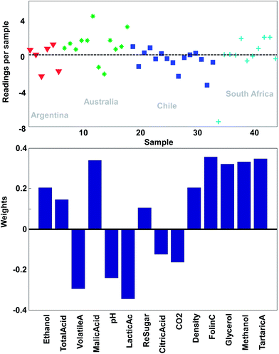 | ||
| Fig. 9 The first principal component of the wine data. The lower plot shows the weights and the upper plot shows the weighted averages obtained with those weights. | ||
Just like the average of ethanol and glycerol or the average school grade, the new variable can be interpreted as “just a variable”. The weights define how the variable is determined and how many scores each sample has of this linear combination. For example, it is seen that most of the South African samples have positive scores and hence, will have fairly high values on variables that have positive weights such as for example methanol. This is confirmed in Fig. 2.
Principal component analysis
Taking linear combinations
It is time to introduce some more formal notation and nomenclature. The weighted average as mentioned above is more formally called a linear combination: it is a way of combining the original variables in a linear way. It is also sometimes called a latent variable where, in contrast, the original variables are manifest.The data are collected in a matrix X with I rows (i = 1, …, I; usually samples/objects) and J columns (j = 1, …, J; usually variables), hence of size I × J. The individual variables (columns) of X are denoted by xj (j = 1, …, J) and are all vectors in the I-dimensional space. A linear combination of those x variables can be written as t = w1 × x1 + … + wJ × xJ, where t is now a new vector in the same space as the x variables (because it is a linear combination of these). In matrix notation, this becomes t = Xw, with w being the vector with elements wj (j = 1, …, J). Since the matrix X contains variation relevant to the problem, it seems reasonable to have as much as possible of that variation also in t. If this amount of variation in t is appreciable, then it can serve as a good summary of the x variables. Hence, the fourteen variables of X can then be replaced by only one variable t retaining most of the relevant information.
The variation in t can be measured by its variance, var(t), defined in the usual way in statistics. Then the problem translates to maximizing this variance choosing optimal weights w1, …, wJ. There is one caveat, however, since multiplying an optimal w with an arbitrary large number will make the variance of t also arbitrary large. Hence, to have a proper problem, the weights have to be normalized. This is done by requiring that their norm, i.e. the sum-of-squared values, is one (see Fig. 5). Throughout we will use the symbol ||.||2 to indicate the squared Frobenius norm (sum-of-squares). Thus, the formal problem becomes
 | (1) |
 | (2) |
Explained variation
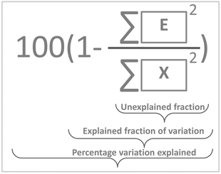
The variance of t can now be calculated but a more meaningful assessment of the summarizing capability of t is obtained by calculating how representative t is in terms of replacing X. This can be done by projecting the columns of X on t and calculating the residuals of that projection. This is performed by regressing all variables of X on t using the ordinary regression equation| X = tpT + E | (3) |
 | (4) |
In Fig. 10, it is illustrated how the explained variation is calculated as also explained around eqn (4).
Note, that the measures above are called variations rather than variances. In order to talk about variances, it is necessary to correct for the degrees of freedom consumed by the model and this is not a simple task. Due to the non-linear nature of the PCA model, degrees of freedom are not as simple to define as for linear models such as in linear regression or analysis of variance. Hence, throughout this paper, the magnitude of variation will simply be expressed in terms of sums of squares. For more information on this, refer to the literature.3,4
PCA as a model
Eqn (3) highlights an important interpretation of PCA: it can be seen as a modelling activity. By rewriting eqn (3) asX = tpT + E = ![[X with combining circumflex]](https://www.rsc.org/images/entities/b_char_0058_0302.gif) + E, + E, | (5) |
 | (6) |
Taking more components
If the percentage of explained variation of eqn (4) is too small, then the t, p combination is not a sufficiently good summarizer of the data. Eqn (5) suggests an extension by writing | (7) |
 | (8) |
History of PCA
PCA has been (re-)invented several times. The earliest presentation was in terms of eqn (6).7 This interpretation stresses the modelling properties of PCA and is very much rooted in regression-thinking: variation explained by the principal components (Pearson's view). Later, in the thirties, the idea of taking linear combinations of variables was introduced8 and the variation of the principal components was stressed (eqn (1); Hotelling's view). This is a more multivariate statistical approach. Later, it was realized that the two approaches were very similar.Similar, but not the same. There is a fundamental conceptual difference between the two approaches, which is important to understand. In the Hotelling approach, the principal components are taken seriously in their specific direction. The first component explains the most variation, the second component the second most, etc. This is called the principal axis property: the principal components define new axes which should be taken seriously and have a meaning. PCA finds these principal axes. In contrast, in the Pearson approach it is the subspace, which is important, not the axes as such. The axes merely serve as a basis for this subspace. In the Hotelling approach, rotating the principal components destroys the interpretation of these components whereas in the Pearson conceptual model rotations merely generate a different basis for the (optimal) subspace.9
Visualization and interpretation
It is now time to discuss how a PCA model can be visualized. There are four parts of a PCA model: the data, the scores, the loadings and the residuals. Visualization of the actual data is often dependent on the type of data and the traditions of a given field. For continuous data such as time-series and spectra, it is often feasible to plot the data as curves whereas more discrete data are often plotted in other ways such as bar plots.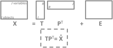 | ||
| Fig. 11 The structure of a PCA model. Note that residuals (E) have the same structure as the data and so does the model approximation of the data (TPT). | ||
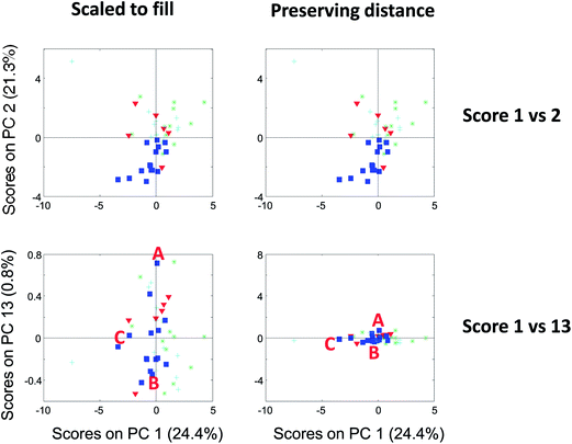 | ||
| Fig. 13 Score plot of component 1 versus 2 (top) and 1 versus 13 (bottom). To the left, the plots are shown filling out the squares and to the right, they are shown preserving distances. | ||
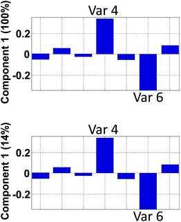 | ||
| Fig. 15 Hypothetical loading vector from a model that explains 100% in component 1 (top) and 14% in component 1 (bottom). | ||
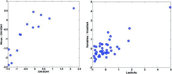 | ||
| Fig. 18 Scatter plot of the preprocessed values of the variables of two wines (left) and two variables (right). | ||
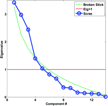 | ||
| Fig. 20 Scree plot for the autoscaled wine data. The decision lines for having eigenvalues larger than one and the broken stick is also shown. | ||
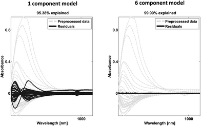 | ||
| Fig. 23 Example of spectral data (grey) and residual spectral information after one (left) and six (right) components. | ||
Residuals can also be plotted as histograms or e.g. normal probability plots in order to see if the residuals are normally distributed. Alternatively, the residuals can be used for calculating the explained or unexplained variation as explained earlier.
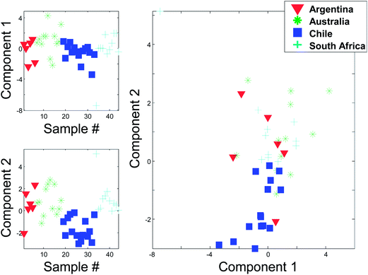
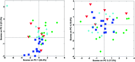
Instead of plotting the scores in line plots, it is also possible to plot them in scatter plots. In Fig. 12 (right), such a scatter plot is shown and from the scatter plot it is more readily seen that there seem to be certain groupings in the data. For example, the Australian and Chilean wines seem to be almost distinctly different in this score plot. This suggests that it is possible to classify a wine using these measured variables. If a new sample ends up in the middle of the Chilean samples, it is probably not an Australian wine and vice versa. This possibility of using PCA for classification forms the basis for the classification method called SIMCA (Soft Independent Modelling of Class Analogies).10,11 The scatter plot can be interpreted in the same way that scatter plots are normally interpreted. For example, a plot of glycerol versus ethanol (Fig. 3) is simple to interpret. Samples that are close have similar glycerol and ethanol. Likewise, for a scatter plot of component 1 and 2. Samples that are close are similar in terms of what the components represent which is defined by the loading vectors. Also, if (and only if) the two components represent all or almost all of the variation in the data, then e.g. two closely lying samples are similar with respect to the actual data.
It is possible to assess similarities and differences among samples in terms of the raw data. If two components explain all or most of the variation in the data, then a score scatter plot will reflect distances in terms of the data directly if the scores are shown on the same scale. That is, the plot must be shown as original scores where the basis is the loading vector. As the loading vectors are unit vectors, they reflect the original data and if the two axes in the plot use the same scale, then distances can be read from the plots directly. If on the other hand the plots are not shown using the same scale on both axis, then assessing distances is not possible.
Compare the two versions of the two score plots in Fig. 13. The lower left plot has widely different scales on the two axes (because one component has much larger values numerically than the other). Henceforth, it is similar to plotting e.g. kilometres on one axis and meters on another. A map with such axes does not preserve distance. Consider, for example, the wine sample marked A. It seems to be closer to sample C than B in the lower left plot. The plot to the lower right preserves distances and here it is readily verified that sample A is, in fact, the closest to B in the space spanned by the two components.
There are several points worth mentioning in relation to this. Score plots are only indicative of the specific fraction of variance they explain. For example, scores that explain three percent do not imply much with respect to the raw data. To assess relative positions such as distances in a score plot, the plot needs to preserve distances. This is mostly a problem in practice, when the magnitude of the two components is widely different. The score plot that does not preserve distances is still useful. For example, the lower left score plot in Fig. 13 is much better for discerning groupings and detecting patterns than the one to the lower right.
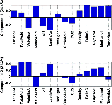
Fig. 14 shows the loadings of the two first components. With these, it is possible to explain what the scores of the model represent. For example, wines from Chile have low (negative) scores for component 2 (Fig. 12). This implies that they have a lot of the opposite of the phenomenon represented in loading 2. Hence, these samples have variation where ethanol, total, volatile, and lactic acids are low at the same time (relatively) while e.g. malic acid is high. Also, and this is an important point, certain variables that have low loadings close to zero, such as e.g. citric acid, do not follow this trend. Hence, the loading tells about what the trend is and also which variables are not part of the trend.
The phenomenon reflected in the principal component is also expected to be visually apparent in the raw data, but only with respect to how much variation of the data this component describes. The first component is seen in the label in Fig. 14 to explain 24.4% of the variation whereas the second one explains 21.3%. Together that means that 45.7% of the variation is explained by these two components. If the two components had explained 100%, all information would be contained in these two components, but for this particular model, half the variation is still retained in other components, so we should remain cautious not to claim that observations from the components are fully indicative of variations in the data.
An example on the importance of this is indicated in Fig. 15. The model reflected in the top plot shows that variables 4 and 6 are perfectly oppositely correlated. The model reflected in the bottom plot does not indicate that. In contrast, the low percentage explained, indicates that there are many other phenomena in the data so the correlation between variable 4 and 6 needs not be close to minus one as it will be in the first model.
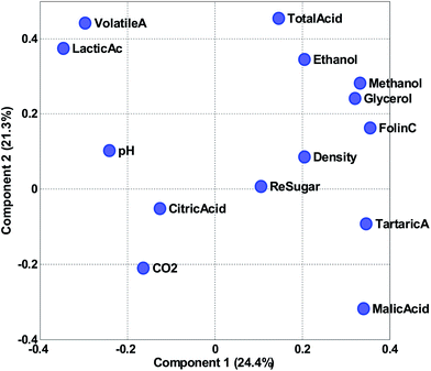
Instead of looking at the loadings in line plots, it is also feasible to make scatter plots (Fig. 16). The scatter plot is often helpful for finding patterns of variation. For example, it is apparent in the plot that volatile acid and lactic acid are generally correlated in approximately 50% of the variation reflected in the two components. Residual sugar seems to be only moderately described in these two components as it is close to zero in both components. As the variables have been auto-scaled, a position close to zero implies that this particular variable does not co-vary with the variation that component 1 and 2 is reflecting.
As for the score scatter plot, distances are only preserved in the loading scatter plot, if the two loadings are plotted on the same scale. The basis for the loadings are the scores and these are generally not unit vectors as they carry the variance of the components. To correct for that, it is possible to simply normalize the scores and multiply the corresponding loading vectors by the inverse normalization factor. In essence, just moving the variance from the score vector to the loading vector.
The principle behind biplots can be explained by representing the PCA model using
| X = TPT = T(norm)SPT | (9) |
| X = T(norm)SPT = T(norm)SαS(1−α)PT | (10) |
It is possible to obtain the two solutions by either setting α equal to one or to zero. In fact, the most common biplot, takes α equal to 0.5 in order to produce a compromise plot where distances in both spaces can be approximately assessed. Hence, α = 0 represents distances for variables (loadings) preserved, α = 1 represents distances for samples (scores) preserved and α = 0.5 represents distances for both samples and variables are (only) approximately preserved.
In addition to this scaling of the variance, there is often also a more trivial scaling of either the whole score matrix or the whole loading matrix to ensure that e.g. the score values are not so small compared to the loadings that they are not visible in a plot.
There are many interesting aspects of biplots and scatterplots but only a few important interpretational issues will be described here.
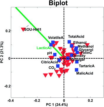
Two objects that are close and far from the origin have similar response (with respect to the variation explained by the components). For example, the two samples CHI-VDA1 and CHI-SCH1 are far from the origin and close together. Hence they are expected to be correlated, but only with respect to the approximately 50% that these two components describe. The two samples are plotted against each other in Fig. 18 (left). Note, that it is the preprocessed data that the PCA model reflects and hence, that interpretations can be made about.
Likewise, two variables that are close and far from the origin are correlated (with respect to the variation explained by the components). An example is given in Fig. 18 (right). Note, that the high correlation is apparently governed by an extreme sample – a potential outlier which will be discussed later.
The center of the plot represents the average sample – not zero – in case the data have been centered. Hence, samples with very negative scores have low values relative to the other samples and samples with high positive scores are the opposite. Again, with respect to the variation explained by the components.
The larger projection a sample has on the vector defined by a given variable, the more that sample deviates from the average on that particular variable (see e.g. how sample SOU-HHI1 projects to the axis defined by the variable lactic acid in Fig. 17).
It is often overlooked, that the above considerations for biplots apply equally well on loading plots or on score plots. Just like above, when for example, loadings are plotted without considering the magnitude of the scores, distances may be impossible to judge.
Practical aspects
Assumptions
In its most basic form, PCA can be seen as a basis for transformation. Instead of using the basis vectors uj = (0, …, 0, 1, 0, …0)′ (with the one at place j) the basis given by p1, …, pJ is used. For this transformation, no assumptions are needed. Considering PCA in the form of eqn (5) and (7), where a model is assumed and least squares fitting is chosen to estimate the parameters T and P, it is not unreasonable to make some assumptions regarding the residuals as collected in E. The mildest assumption is that one of these residuals being independently and identically distributed (iid), without specifying more than that this distribution is symmetrical around zero. Hence, there are no systematic errors and the error is homoscedastic.When the errors are heteroscedastic and there is a model for the error, then eqn (7) can be fitted under this error model by using maximum likelihood or weighted least squares approaches.15−17 Although this solves the problem of heteroscedasticity, certain implementations of maximum likelihood fitting remove various aspects of the simplicity of PCA (orthogonal scores, nestedness of solutions, etc.).
Inference/validation
Since the PCA model parameters are used for interpretation and exploration, it is reasonable to ask how stable the results are. This calls for statistical inference tools. There are different routes to take in this respect. Upon assuming multivariate normality of the x-variables, statistical inference for the scores and loadings are available (see e.g. Anderson,18 pp. 468). Multivariate normality cannot always be assumed, but approximate normality of the scores – they are linear combinations – envoking the Central Limit Theorem can sometimes be done. For a distribution-free approach, resampling methods can be used, e.g., bootstrapping. This is, however, not trivial and several alternatives exist.19,20Preprocessing
Often a PCA performed on the raw data is not very meaningful. In regression analysis, often an intercept or offset is included since it is the deviation from such an offset, which represents the interesting variation. In terms of the prototypical example, the absolute levels of the pH is not that interesting but the variation in pH of the different Cabernets is relevant. For PCA to focus on this type of variation it is necessary to mean-center the data. This is simply performed by subtracting from every variable in X the corresponding mean-level.Sometimes it is also necessary to think about the scales of the data. In the wine example, there were measurements of concentrations and of pH. These are not on the same scales (not even in the same units) and to make the variables more comparable, the variables are scaled by dividing them by the corresponding standard deviations. The combined process of centering and scaling in this way is often called autoscaling. For a more detailed account of centering and scaling, see the literature.21,22
Centering and scaling are the two most common types of preprocessing and they normally always have to be decided upon. There are many other types of preprocessing methods available though. The appropriate preprocessing typically depends on the nature of the data investigated.23–27
Choosing the number of components
A basic rationale in PCA is that the informative rank of the data is less than the number of original variables. Hence, it is possible to replace the original J variables with R (R ≪ J) components and gain a number of benefits. The influence of noise is minimized as the original variables are replaced with weighted averages,28 and the interpretation and visualization is greatly aided by having a simpler (fewer variables) view to all the variations. Furthermore, the compression of the variation into fewer components can yield statistical benefits in further modelling with the data. Hence, there are many good reasons to use PCA. In order to use PCA, though, it is necessary to be able to decide on how many components to use. The answer to that problem depends a little bit on the purpose of the analysis, which is why the following three sections will provide different answers to that question.If outliers are to be diagnosed with appropriate statistics (see next section), then, however, it is more important to establish the number of components to use. For example, the residual will change depending on how many components are used, so in order to be able to assess residuals, a reasonable number of components must be used. There are several ad hoc approaches that can be used to determine the number of components. A selection of methods is offered below, but note that these methods seldom provide clear-cut and definitive answers. Instead, they are often used in a combined way to get an impression on the effective rank of the data.
| Az = λz | (11) |
| A = ZΛZT | (12) |
The singular value decomposition of X (I × J) is given by
| X = USVT | (13) |
| XTX = VSTUTUSVT = VS2VT = ZΛZT. | (14) |
This shows the relationship between the singular values and the eigenvalues. The eigenvalue corresponding to a component is the same as the squared singular value which again is the variation of the particular component.
For real data, the plots may even be more difficult to use as also exemplified in the original publication of Cattell as well as in many others.31−33 Cattell himself admitted that: “Even a test as simple as this requires the acquisition of some art in administering it”. This, in fact, is not particular to the scree test but goes for all methods for selecting the number of components.
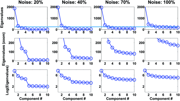
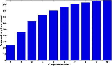
For the wine data, it is not easy to firmly assess the number of components based on the scree test (Fig. 20). One may argue that seven or maybe nine components seem feasible, but this would imply incorporating components that explain very little variation. A more obvious choice would probably be to assess three components as suitable based on the scree plot and then be aware that further components may also contain useful information.
 | (15) |
As seen in Fig. 20, the broken stick would seem to indicate that three to four components are reasonable.
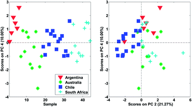
In Fig. 22, it is shown, that there is distinct structure in the scores of component four. For example, the wines from Argentina all have positive scores. Such a structure or grouping will not happen accidentally unless unfortunate confounding has occurred. Hence, as long as Argentinian wines were not measured separately on a different system or something similar, the mere fact that component four (either scores or loadings) shows distinct behaviour is an argument in favour of including that component. This holds regardless of what other measures might indicate.
The loadings may also provide similar validation by highlighting correlations expected from a priori knowledge. In the case of continuous data such as time series or spectral data, it is also instructive to look at the shape of the residuals. An example is provided in Fig. 23. A dataset consisting of visual and near-infrared spectra of 40 beer samples is shown in grey. After one component, the residuals are still fairly big and quite structured from a spectral point of view. After six components, there is very little information left indicating that most of the systematic variation has been modelled. Note from the title of the plot, that 95% of the variation explained is quite low for this dataset whereas that would be critically high for the wine data as discussed above.
The idea in cross-validation is to leave out part of the data and then estimate the left-out part. If this is done wisely, the prediction of the left-out part is independent of the actual left-out part. Hence, overfitting leading to too optimistic models is not possible. Conceptually, a single element (typically more than one element) of the data matrix is left out. A PCA model handling missing data,42−46 can then be fitted to the dataset and based on this PCA model, an estimate of the left out element can be obtained. Hence, a set of residuals is obtained where there are no problems with overfitting. Taking the sum of squares of these yields the so-called Predicted REsidual Sums of Squares (PRESS)
 | (16) |
 | (17) |
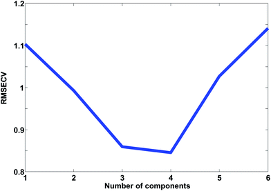
In Fig. 24, the results of cross-validation are shown. As shown in Fig. 21 the fit to data will trivially improve with the number of components but the RMSECV gets worse after four components, indicating that no more than four components should be used. In fact, the improvement going from three to four components is so small, that three is likely a more feasible choice from that perspective.
The cross-validated error, RMSECV, can be compared to the fitted error, the Root Mean Squared Error of Calibration, RMSEC. In order for the two to be comparable though, the fitted residuals must be corrected for the degrees of freedom consumed by the model. Calculating these degrees of freedom is not a trivial subject as mentioned earlier.3,4,47
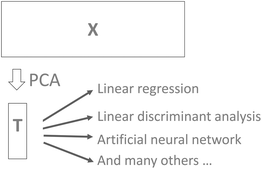
It is common practice to use, for example, cross-validation for determining the number of components and then use that number of components in further modelling. For example, the scores may be used for building a classification model using linear discriminant analysis. While this approach to selecting components is both feasible and reasonable there is a risk that components that could help improve classification would be left out. For example, cross-validation may indicate that five components are valid, but it turns out that component seven can reliably improve classification. In order to be certain that useful information is retained in the PCA model, it is generally advised to validate the number of components in terms of the actual goal. Instead of validating the number of components that best describe X in some sense (PCA cross-validation), it will often make more sense to use the number of components that provides the best classification results if PCA is used in conjunction with discriminant analysis.
Detecting outliers
Outliers are samples that are somehow disturbing or unusual. Often, outliers are downright wrong samples. For example, in determining the height of persons, five samples are obtained ([1.78, 1.92, 1.83, 167, 1.87]). The values are in meters but accidentally, the fourth sample has been measured in centimeters. If the sample is not either corrected or removed, the subsequent analysis is going to be detrimentally disturbed by this outlier. Outlier detection is about identifying and handling such samples. An alternative or supplement to outlier handling is the use of robust methods, which will however, not be treated in detail here. The reader is referred to the literature for more details on robust methods.48−59This section is mainly going to focus on identifying outliers, but understanding the outliers is really the critical aspect. Often outliers are mistakenly taken to mean ‘wrong samples’ and nothing could be more wrong! Outliers can be absolutely right, but e.g. just badly represented. In such a case, the solution is not to remove the outlier, but to supplement the data with more of the same type. The bottom line is that it is imperative to understand why a sample is an outlier. This section will give the tools to identify the samples and see in what way they differ. It is then up to the data analyst to decide how the outliers should be handled.
As for the data, it is a good idea to plot the scores in many ways, using different combinations of scatter plots, line plots, histograms, etc. Also, it is often useful to go through the same plot but coloured by all the various types of additional information available. This could be any kind of information such as temperature, storage time of sample, operator or any other kind of either qualitative or quantitative information available. For the wine data model, it is seen (Fig. 26) that one sample is behaving differently from the others in score plot one versus two (upper left corner).
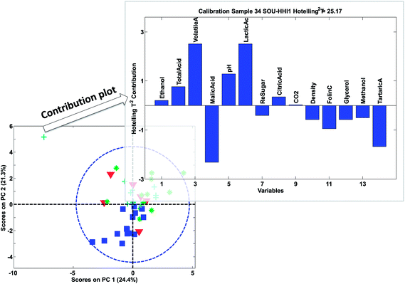
Looking at the loading plot (Fig. 16) indicates that the sample must be (relatively) high in volatile and lactic acid and low in malic acid. This should then be verified in the raw data. After removing this sample, the model is rebuilt and reevaluated. No more extreme samples are observed in the scores.
Before deciding on what to do with an outlier, it is necessary to look at how important the component is. Imagine a sample that is doing an ‘excellent job’ in the first seven components, but in the eighth has an outlying behaviour. If that eighth component is very small in terms of variation explained and not the most important for the overall use of the model; then it is probably not urgent to remove such a sample.
Whenever in doubt as to whether to remove an outlier or not, it is often instructive to compare the models before and after removal. If the interpretation or intended use changes dramatically, it indicates that the sample has an extreme behaviour that needs to be handled whereas the opposite indicates that it is of little importance whether the sample is removed.
 | (18) |
 | (19) |
In Fig. 27, an example of the 95% confidence limits is shown. This plot illustrates the somewhat deceiving effect such limits can have. Two samples are outside the confidence limit leading the inexperienced user to suggest leaving out both. However, first of all, samples should not be left out without understanding why they are ‘wrong’ and more importantly, there is nothing in what we know about the data thus far, that suggests the scores would follow a multivariate normal distribution. Hence, the limit is rather arbitrary and for this particular dataset, the plot in Fig. 26 is definitely to be preferred when assessing if samples behave reasonably. In some cases, when enough samples are available and those samples really do come from the same population, the scores are approximately normally distributed. This goes back to the central limit theorem.62 Examples are, e.g. in the multivariate process control area.63 In those cases Hotelling's T2 is a particularly useful statistic.
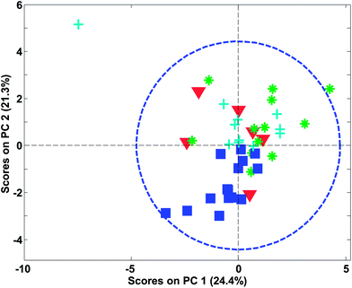 | ||
| Fig. 27 PCA score plot similar to Fig. 26 (left) but now with a 95% confidence limit shown. | ||
The limits provided by Hotelling's T2 can be quite misleading for grouped data. As an example, Fig. 28 shows the score plot of a dataset, where the samples fall in four distinct groups (based on the geological background). The sample in the middle called “outlier?” is by no means extreme with respect to Hotelling's T2 even though the sample is relatively far from all other samples.
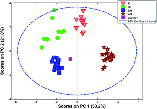 | ||
| Fig. 28 PCA scores plot (1 vs. 2) for a dataset consisting of ten concentrations of trace elements in obsidian samples from four specific quarries – data from a study by Kowalski et al.64 | ||
 | (20) |
The vector tr is rth score vector from the calibration model, I the number of samples in the calibration set and tnewr is the score of the sample in question. It can come from the calibration set or be a new sample. xnewj is the data of the sample in question for variable j and pjr is the corresponding loading element. In this case, R components are considered, but fewer components can also be considered by adjusting the summation in eqn (20).
The contribution plot indicates what variables make the selected sample have an extreme Hotelling's T2 and in Fig. 29, the most influential variables are also the ones that that are visible in the raw data (not shown). Eqn (20) explains the simplest case of contribution plots with orthogonal P matrices. Generalized contributions are available for non-orthogonal cases.65 Note that if xnewj is a part of the calibration set, it influences the model. A more objective measure of whether xnewj fits the model can be obtained by removing it from the data and then afterwards projecting it onto the model thereby obtaining more objective scores and residuals.
In Fig. 30, it is seen that colouring the scores by the distance to the nearest neighbour, highlights that there are, in fact, several samples that are not very close to other samples. When the samples are no longer coloured by class as shown in Fig. 28, it is much less obvious that the green ‘K’ class is indeed a well-defined class.
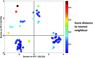 | ||
| Fig. 30 Score plot of Fig. 28. Samples are coloured according to the distance of the sample to the nearest neighbour. | ||
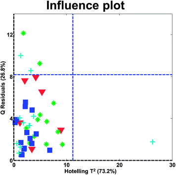
In the influence plot in Fig. 31, it is clear that one sample stands out with a high Hotelling's T2 in the PCA model and no samples have extraordinarily large residuals. It will hence, be reasonable to check the T2 contribution plot of that sample, to see if an explanation for the extreme behavior can be obtained. The two blue lines are 95% confidence levels. Such lines are often given in software but should not normally be the focus of attention as also described above for score plots.
Conclusion
Principal component analysis is a powerful and versatile method capable of providing an overview of complex multivariate data. PCA can be used e.g. for revealing relations between variables and relations between samples (e.g. clustering), detecting outliers, finding and quantifying patterns, generating new hypotheses as well as many other things. This tutorial has provided a description of the basic concepts of how to use PCA critically.References
- T. Skov, D. Ballabio and R. Bro, Multiblock variance partitioning: a new approach for comparing variation in multiple data blocks, Anal. Chim. Acta, 2008, 615, 18–29 CrossRef CAS PubMed.
- D. Ballabio, T. Skov, R. Leardi and R. Bro, Classification of GC-MS measurements of wines by combining data dimension reduction and variable selection techniques, J. Chemom., 2008, 22, 457–463 CrossRef CAS.
- K. Faber, Degrees of freedom for the residuals of a principal component analysis — A clarification, Chemometrics and Chemoinformatics, 2008, vol. 93, pp. 80–86 Search PubMed.
- H. Martens, S. Hassani, E. M. Qannari and A. Kohler, Degrees of freedom estimation in Principal Component Analysis and Consensus Principal Component Analysis, Chemom. Intell. Lab. Syst., 2012, 118, 246–259 CrossRef.
- J. M. F. ten Berge, Least squares optimization in multivariate analysis, DSWO Press, Leiden, 1993 Search PubMed.
- A. K. Smilde, H. C. J. Hoefsloot, H. A. L. Kiers, S. Bijlsma and H. F. M. Boelens, Sufficient conditions for unique solutions within a certain class of curve resolution models, J. Chemom., 2001, 15(4), 405–411 CrossRef CAS.
- K. Pearson, On lines and planes of closest fit to points in space, Philos. Mag., 1901, 2, 559–572 CrossRef.
- H. Hotelling, Analysis of a complex of statistical variables into principal components, J. Educ. Psychol., 1933, 24, 417–441 CrossRef.
- J. M. F. ten Berge and H. A. L. Kiers, Are all varieties of PCA the same? A reply to Cadima & Jolliffe, Br. J. Math. Stat. Psychol., 1997, 50(2), 367–368 CrossRef.
- S. Wold, C. Albano, W. J. Dunn, III, U. Edlund, K. H. Esbensen, P. Geladi, S. Hellberg, E. Johansson, W. Lindberg and M. Sjöström, Multivariate data analysis in chemistry, in Chemometrics. Mathematics and Statistics in Chemistry, ed. B. R. Kowalski, D. Reidel Publishing Company, Dordrecht, 1984, pp. 17–95 Search PubMed.
- I. E. Frank and S. Lanteri, Classification models: discriminant analysis, SIMCA, CART, Chemom. Intell. Lab. Syst., 1989, 5, 247–256 CrossRef CAS.
- J. C. Gower, A general theory of Biplots, in Recent Advances in Descriptive Multivariate Analysis, ed. W. J. Krzanowski, Clarendon Press, Oxford, 1995, pp. 283–303 Search PubMed.
- A. Carlier and P. M. Kroonenberg, Decompositions and biplots in three-way correspondence analysis, Psychometrika, 1996, 61, 355–373 CrossRef.
- K. R. Gabriel, The biplot graphic display of matrices with application to principal component analysis, Biometrika, 1971, 58, 453–467 CrossRef.
- R. Bro, N. D. Sidiropoulos and A. K. Smilde, Maximum likelihood fitting using simple least squares algorithms, J. Chemom., 2002, 16(8–10), 387–400 CrossRef CAS.
- D. T. Andrews and P. D. Wentzell, Applications of maximum likelihood principal component analysis: incomplete data sets and calibration transfer, Anal. Chim. Acta, 1997, 350(3), 341–352 CrossRef CAS.
- P. D. Wentzell, D. T. Andrews, D. C. Hamilton, N. M. Faber and B. R. Kowalski, Maximum likelihood principal component analysis, J. Chemom., 1997, 11(4), 339–366 CrossRef CAS.
- T. W. Anderson, An Introduction to Multivariate Statistical Analysis, Wiley, 2nd edn, 1984 Search PubMed.
- M. E. Timmerman, H. A. L. Kiers and A. K. Smilde, Estimating confidence intervals for principal component loadings: a comparison between the bootstrap and asymptotic results, Br. J. Math. Stat. Psychol., 2007, 60(2), 295–314 CrossRef PubMed.
- H. Babamoradi and F. van den Berg, Rinnan, Å. Bootstrap based Confidence Limits in Principal Component Analysis–a case study, Chemom. Intell. Lab. Syst., 2013, 120, 97–105 CrossRef CAS.
- R. A. van den Berg, H. C. J. Hoefsloot, J. A. Westerhuis, A. K. Smilde and M. van der Werf, Centering, scaling, and transformations: improving the biological information content of metabolomics data, BMC Genomics, 2006, 7(142) CAS.
- R. Bro and A. K. Smilde, Centering and scaling in component analysis, J. Chemom., 2003, 17(1), 16–33 CrossRef CAS.
- N. K. Afseth, V. H. Segtnan and J. P. Wold, Raman spectra of biological samples: a study of preprocessing methods, Appl. Spectrosc., 2006, 60(12), 1358–1367 CrossRef CAS PubMed.
- C. D. Brown, L. Vega-Montoto and P. D. Wentzell, Derivative preprocessing and optimal corrections for baseline drift in multivariate calibration, Appl. Spectrosc., 2000, 54(7), 1055–1068 CrossRef CAS.
- S. N. Deming, J. A. Palasota and J. M. Nocerino, The geometry of multivariate object preprocessing, J. Chemom., 1993, 7, 393–425 CrossRef CAS.
- H. Martens and E. Stark, Extended multiplicative signal correction and spectral interference subtraction: new preprocessing methods for near infrared spectroscopy, J. Pharm. Biomed. Anal., 1991, 9(8), 625–635 CrossRef CAS PubMed.
- M. Pardo, G. Niederjaufner, G. Benussi, E. Comini, G. Faglia, G. Sberveglieri, M. Holmberg and I. Lundstrom, Data preprocessing enhances the classification of different brands of Espresso coffee with an electronic nose, Sens. Actuators, B, 2000, 69(3), 397–403 CrossRef CAS.
- R. Bro, Multivariate calibration - What is in chemometrics for the analytical chemist?, Anal. Chim. Acta, 2003, 500(1–2), 185–194 CrossRef CAS.
- O. E. de Noord, The influence of data preprocessing on the robustness and parsimony of multivariate calibration models, Chemom. Intell. Lab. Syst., 1994, 23, 65–70 CrossRef.
- R. B. Cattell, The scree test for the number of factors, Multivariate Behav. Res., 1966, 1, 245–276 CrossRef.
- P. M. Bentler and K. H. Yuan, Test of linear trend in eigenvalues of a covariance matrix with application to data analysis, Br. J. Math. Stat. Psychol., 1996, 49(2), 299–312 CrossRef PubMed.
- P. M. Bentler and K. H. Yuan, Tests for linear trend in the smallest eigenvalues of the correlation matrix, Psychometrika, 1998, 63, 131–144 CrossRef.
- R. C. Henry, E. S. Park and C. Spiegelman, Comparing a new algorithm with the classic methods for estimating the number of factors, Chemom. Intell. Lab. Syst., 1999, 48, 91–97 CrossRef CAS.
- H. F. Kaiser, The Application of Electronic Computers to Factor Analysis, Educ. Psychol. Meas., 1960, 20, 141–151 CrossRef.
- N. Cliff, The Eigenvalues-Greater-Than-One Rule and the Reliability of Components, Psychol. Bull., 1988, 103(2), 276–279 CrossRef.
- L. Guttman, Some necessary conditions for common-factor analysis, Psychometrika, 1954, 19(2), 149–161 CrossRef.
- S. Frontier, Étude de la decroissance des valeurs propers dans une analyze en composantes principales: comparison avec le modèle de baton brisé, J. Exp. Mar. Biol. Ecol., 1976, 25, 67–75 CrossRef.
- R. H. MacArthur, On the relative abundance of bird species, Proc. Natl. Acad. Sci. U. S. A., 1957, 43(3), 293–295 CrossRef CAS.
- S. Wold, Cross-validatory estimation of the number of components in factor and principal components models, Technometrics, 1978, 20, 397–405 CrossRef.
- W. J. Krzanowski and P. Kline, Cross-validation for choosing the number of important components in principal component analysis, Multivariate Behav. Res., 1995, 30(2), 149–165 CrossRef.
- R. Bro, K. Kjeldahl, A. K. Smilde and H. A. L. Kiers, Cross-validation of component models: a critical look at current methods, Anal. Bioanal. Chem., 2008, 390, 1241–1251 CrossRef CAS PubMed.
- T. C. Gleason and R. Staelin, A proposal for handling missing data, Psychometrika, 1975, 40, 229–252 CrossRef.
- P. R. C. Nelson, P. A. Taylor and J. F. MacGregor, Missing data methods in PCA and PLS: score calculations with incomplete observations, Chemom. Intell. Lab. Syst., 1996, 35(1), 45–65 CrossRef CAS.
- B. Grung and R. Manne, Missing values in principal component analysis, Chemom. Intell. Lab. Syst., 1998, 42, 125–139 CrossRef CAS.
- B. Walczak and D. L. Massart, Dealing with missing data Part I, Chemom. Intell. Lab. Syst., 2001, 58(1), 15–27 CrossRef CAS.
- E. Adams, B. Walczak, C. Vervaet, P. G. Risha and D. L. Massart, Principal component analysis of dissolution data with missing elements, Int. J. Pharm., 2002, 234(1–2), 169–178 CrossRef CAS PubMed.
- J. Mandel, The partitioning of interaction in analysis of variance, J. Res. Natl. Bur. Stand., Sect. B, 1969, 73B, 309–328 CrossRef.
- S. J. Devlin, R. Gnanadesikan and J. R. Kettenring, Robust estimation of dispersion matrices and principal components, J. Am. Stat. Assoc., 1981, 76(375), 354–362 CrossRef.
- O. S. Borgen and Å. Ukkelborg, Outlier detection by robust alternating regression, Anal. Chim. Acta, 1993, 277, 489–494 CrossRef.
- Y. Xie, J. Wang, Y. Liang, L. Sun, X. Song and R. Yu, Robust principal component analysis by projection pursuit, J. Chemom., 1993, 7, 527–541 CrossRef CAS.
- H. Hove, Y. Liang and O. M. Kvalheim, Trimmed object projections: a nonparametric robust latent-structure decomposition method, Chemom. Intell. Lab. Syst., 1995, 27, 33–40 CrossRef CAS.
- J. G. Chen, J. A. Bandoni and J. A. Romagnoli, Robust PCA and normal region in multivariate statistical process monitoring, AIChE J., 1996, 42(12), 3563–3566 CrossRef CAS.
- W. C. Chen, H. Cui and Y. Z. Liang, A new principal component analysis method based on robust diagnosis, Anal. Lett., 1996, 29, 1647–1667 CrossRef CAS.
- A. Singh, Outliers and robust procedures in some chemometric applications, Chemom. Intell. Lab. Syst., 1996, 33, 75–100 CrossRef CAS.
- E. V. Thomas and N. X. Ge, Development of robust multivariate calibration models, Technometrics, 2000, 42(2), 168–177 CrossRef.
- K. A. Hoo, K. J. Tvarlapati, M. J. Piovoso and R. Hajare, A method of robust multivariate outlier replacement, Comput. Chem. Eng., 2002, 26(1), 17–39 CrossRef CAS.
- M. Hubert, P. J. Rousseeuw and K. Vanden Branden, ROBPCA: a new approach to robust principal component analysis, Technometrics, 2005, 47(1), 64–79 CrossRef.
- S. F. Møller, J. V. F. Frese and R. Bro, Robust methods for multivariate data analysis, J. Chemom., 2005, 19, 549–563 CrossRef.
- P. J. Rousseeuw, M. Debruyne, S. Engelen and M. Hubert, Robustness and outlier detection in chemometrics, Crit. Rev. Anal. Chem., 2006, 36(3–4), 221–242 CrossRef CAS.
- H. Hotelling, The generalization of Student's ratio, Ann. Math. Stat., 1931, 2, 360–378 CrossRef.
- J. E. Jackson, Principal components and factor analysis: part I - principal components, J. Qual. Tech., 1980, 12, 201–213 Search PubMed.
- A. M. Mood, F. R. Graybill and D. C. Boes, Introduction to the Theory of Statistics, McGraw-Hill, 3rd edn, 1974 Search PubMed.
- P. Nomikos and J. F. MacGregor, Multivariate SPC charts for monitoring batch processes, Technometrics, 1995, 37, 41–59 CrossRef.
- B. R. Kowalski, T. F. Schatzki and F. H. Stross, Classification of archaeological artifacts by applying pattern recognition to trace element data, Anal. Chem., 1972, 44(13), 2176–2180 CrossRef CAS.
- J. A. Westerhuis, S. P. Gurden and A. K. Smilde, Generalized contribution plots in multivariate statistical process monitoring, Chemom. Intell. Lab. Syst., 2000, 51(1), 95–114 CrossRef CAS.
- P. Nomikos, Detection and diagnosis of abnormal batch operations based on multiway principal component analysis, ISA Trans., 1996, 35, 259–266 CrossRef.
- B. M. Wise, N. L. Ricker and D. Veltkamp, Upset and Sensor Failure Detection in Multivariate Processes, AIChE 1989 Annual Meeting, Nov. 1989 Search PubMed.
| This journal is © The Royal Society of Chemistry 2014 |


